Role
Designer & Builder
Platform
Wall tablet · Desktop · Mobile
Stack
Home Assistant · Custom JS
Status
Live — two homes, daily use
Overview
Six ecosystems that were never meant to meet
My apartment on the 47th floor of a Tokyo high-rise runs on half a dozen ecosystems that were never designed to meet: SmartThings air conditioning and sensors, Z-Wave lighting, two Volumio music streamers, a Denon AV receiver, and cameras. Each shipped with its own app, its own login, and its own opinion.
Home Assistant can unify all of it — it is the most capable smart-home platform there is, and famously unapproachable. Out of the box it’s a tool built by engineers for engineers: infinitely flexible, visually generic, and a dashboard you’d actually want to live with is not something a non-coder can build. The capability is all there; the experience isn’t. That gap is a design problem, and it’s the one this project exists to close.
So I designed and built a single custom interface on top of Home Assistant that replaces all of it — a wall-mounted tablet as the home’s primary surface, with the same experience responsive across desktop and phone. My users are the hardest kind to satisfy: my family, every day, in two houses.
Origin
Twenty years to a home I could trust
The smart home has been promised for thirty years, and I should have been the person it came easy to — my whole career before design was systems integration and security. Instead I spent the better part of two decades fighting the wrong half of the problem: not whether it could work, but whether it could be beautiful and trustworthy at the same time.
The fight was always the protocols and the interface. X10 could switch a light but couldn’t tell me whether it actually turned on; SmartThings could make devices talk but never gave me a dashboard worth living in; ActionTiles finally did — until its servers went dark overnight and took every screen in the house with them. If it lives in someone else’s cloud, it isn’t mine. And nobody owns this market, so every choice — a wall-switch module, roller blinds, a water sensor — is a gamble: built around a protocol today, discontinued tomorrow, with no standard to bet on.
Home Assistant was the first platform open enough to escape all that — but its stock dashboards are built by engineers, for engineers, and the promise kept dying on the last mile: the interface. What finally closed the gap wasn’t a new protocol; it was AI. I could hand off the execution and finally build the system that was always supposed to exist — the judgment still mine, the labor no longer the bottleneck. It doesn’t try to be everything; it does exactly what I need, built to grow when I do. It’s a utility — and after twenty years, a trustworthy one.
Who it’s for
One thing everyone wants, no good way to get it
I built this for my own house — but strip away my rooms and my family’s habits and the design underneath serves anyone who wants their home to feel like one calm, trustworthy place instead of a drawer full of apps. It always starts the same way: a house full of “smart” things that never became a home.
Pain points
- “Why do I need three apps and five taps to cool one room?”
- “The wall tablet says a light is on. It isn’t. Now I don’t trust it.”
- “Home Assistant can do anything — and none of it out of the box.”
- “I just want to play a record without the streamer fighting the amplifier.”
- “Anyone should be able to walk up and use it with zero instructions.”
Three people pull that design in three different directions — and each wants something completely different from the same screen on the wall.
The taste-led professional
Marco, and a home that never matched his eye
He designs beautiful spaces for a living, and his own home runs on a dozen apps that look like engineers built them — because engineers did. For him, amazing is a control surface as considered as the rooms it controls.
Marco Ferretti
Architect · 44
“Everything in my home is chosen with care — except the thing I touch most.”
Amazing =A home interface as considered as the spaces I design.
Goals
- A control surface that looks like it belongs in his home.
- One place for lights, climate, and music — no brand names.
- To not become a part-time systems integrator.
Frustrations
- Every smart-home app is generic and ugly.
- Home Assistant is powerful but reads like a spreadsheet.
- The off-the-shelf options feel like control panels, not rooms.
The moment that matters
- A guest glances at the wall tablet.
- It should read as part of the home, not a gadget.
The user journey
From an apologetic tablet to the best thing on the wall
Marco’s journey is the gap between how good his home looks and how badly its controls behave — and the day that gap finally closed.
MFMarco’s journeyArchitect
01 · The problem
Embarrassed
The one ugly thing
Every surface in his home is deliberate — except the pile of apps he actually uses to run it.
“I’d never let a client live with an interface this ugly.”
02 · Discovery
Intrigued
“It can look like anything?”
He sees a home dashboard designed like a real product — dark, typographic, calm — not a grid of stock widgets.
“So the ceiling isn’t the platform. It’s the design.”
03 · First use
Pleased
It reads like his home
One tablet by the door: lights, climate, and music in one calm language, no logos, no clutter.
“This finally belongs here.”
04 · The doubt
Wary
“Will it stay this good?”
The make-or-break: does it stay coherent when he adds a device, or does it decay back into dashboard-ugly?
“A design that only works on day one isn’t a design.”
→ Answered by a Figma-first design language — every new device inherits the same type, color, and long-press detail, so nothing breaks the room.
05 · It works
Proud
The nicest object on the wall
Months in, the tablet is something he wants people to notice — and it still looks like the day it shipped.
“It looks like I designed it. Because, in a way, I did.”
→ Answered by progressive disclosure — a calm surface with depth a tap away, so it never gets busy to stay powerful.
06 · Advocacy
Sold
Shows every client
It becomes part of his pitch: your home can feel this considered, all the way down to the light switch.
“This is what I mean by finished.”
For Marco the win was never features — it was a home interface that met the same bar as everything else he owns. The hard part isn’t making one screen look good; it’s keeping it coherent as real devices pile up. That’s the part this got right.
The multigenerational household
Grace, and the home the whole family had to share
Three generations live under her roof, from a father in his eighties to kids who’ve never known a world without touchscreens. For her, amazing is one surface every single one of them can actually use — no one left out, no one calling her for help.
Grace Bello
Runs the household · 52
“If my father can’t use it, it doesn’t work — no matter how clever it is.”
Amazing =One surface the whole house can use, grandparent to grandchild.
Goals
- Her father adjusts the heat without asking anyone.
- Everyone reads it in their own language and units.
- A guest walks up and just uses it.
Frustrations
- Every app assumes one tech-savvy user — not a household.
- She’s become the family help desk.
- A screen that lies loses the older users for good.
The moment that matters
- Her father walks up to the tablet, alone.
- It has to be obvious, in his units, first try.
The user journey
The day her father stopped asking for help
Grace’s journey isn’t about features — it’s about whether the least technical person in the house can walk up and win, without her.
GBGrace’s journeyRuns the household
01 · The problem
Stretched thin
The family help desk
Every “smart” thing has its own app for one savvy user — so everything routes through her.
“Why am I the only one who can turn on the heat?”
02 · Discovery
Hopeful
“One screen for everyone?”
She finds a single interface built for the room, not the power user — big, plain, one tap.
“If everyone can use it, I get my evenings back.”
03 · First use
Relieved
The kids get it instantly
The younger half of the house takes to it in seconds — scenes, lights, music, all obvious.
“Okay. But the real test is upstairs.”
04 · The doubt
Anxious
“Will Dad use it?”
The make-or-break: her eighty-year-old father, alone at the tablet, in his own units.
“One confusing tap and he goes back to the wall switch forever.”
→ Answered by one-tap controls, dual units, and a zero-instruction layout — nothing to learn, nothing to read, his numbers not mine.
05 · It works
Delighted
He does it himself
Her father cools his room, in the temperature scale he thinks in, without calling anyone.
“He didn’t ask me. He just did it.”
→ Answered by honest state — what the tablet shows is what’s actually on, so it never sends him back to the wall switch.
06 · Advocacy
Proud
The whole house adopts it
It becomes the one thing everyone agrees on — and she’s finally off help-desk duty.
“It works for all of us. That never happens.”
Grace’s win was nobody left out. An interface that only satisfies the power user fails a real household — designing for the least technical person in the room is what makes it work for everyone.
The local-first owner
Ravi, and the home that answers to no one
He lost a whole smart-home setup once when a company switched off its servers overnight — and he’s never trusted the cloud with his house since. For him, amazing is a home that runs on his own network and answers to no server but his.
Ravi Menon
Security engineer · 39
“I’m not handing the keys to my house to someone else’s server.”
Amazing =A home that runs locally and answers to no server but mine.
Goals
- Everything runs on his own network, no data leaving.
- No subscription that can be revoked or shut down.
- A system he can see, host, and fully control.
Frustrations
- Cloud smart-home products die on the vendor’s schedule.
- Self-hosted usually means ugly and unusable.
- He shouldn’t have to choose between control and craft.
The moment that matters
- The internet goes down.
- His home has to keep working anyway.
The user journey
A home that kept working when the internet didn’t
Ravi’s journey turns on a single question the cloud can never answer honestly: when the servers go away, is my home still mine?
RMRavi’s journeySecurity engineer
01 · The problem
Burned
The day the servers went dark
A vendor shut down its cloud and took his entire setup with it, overnight.
“Never again. If it isn’t mine, it isn’t safe.”
02 · Discovery
Cautiously hopeful
“Local, and actually good?”
He finds a self-hosted interface that runs entirely on his own hardware — no account, no vendor, nothing that can be switched off from outside his walls.
“Finally, one that answers to me.”
03 · First use
Reassured
His network, his rules
Every control responds instantly off his own network, and nothing he touches ever leaves the house.
“Nothing here is phoning home.”
04 · The doubt
Testing it
“What happens when I pull the plug?”
The make-or-break: he cuts the internet to see whether his home keeps working — or falls over like the last one.
“A home that needs the cloud to turn on a light isn’t mine.”
→ Answered by a local-first architecture with a watchdog — it runs on the LAN, recovers stale state itself, and reaches the outside only when he chooses.
05 · It works
Vindicated
Lights on, internet off
The connection drops and the house doesn’t notice — every control still works, instantly, locally.
“This one can’t be switched off by someone else.”
→ Answered by optional cloud relay — remote access when he wants it, never a dependency he can’t sever.
06 · Advocacy
Convinced
Tells every skeptic
He’s the proof that local-first doesn’t have to mean ugly — and he says so, loudly.
“You can own it and it can still be beautiful.”
Ravi’s win was ownership without compromise — a home that stays his when the servers, the subscriptions, and the internet all go away. Not something he rents from a company that can change its mind — something he can see, host, and hold.
The reframe
Not a smart home — a home you never have to think about
Forget the six systems for a second. The perfect version of this isn’t a wall of controls at all — it’s a home that simply behaves. The room is the right temperature. The record plays. The light you tapped is on, and the screen agrees. You never wonder whether it worked, and you never think about the six systems underneath.
Nobody ships that, and here’s the wall: the pieces come from half a dozen clouds that were never meant to meet, wrapped in dashboards built by engineers for engineers. The capability is all there; the calm isn’t. The only thing that closes that gap is trust — state you can believe, one language across every device, and a system that answers to you and not to someone else’s server.
Getting a solo designer anywhere near that used to be impossible — it’s a team’s worth of engineering. What changed is the collaborator. AI didn’t design this home, but it’s the reason one person’s design judgment could actually become a working, trustworthy product on the wall.
01 — One pane of glass
Six ecosystems, one surface
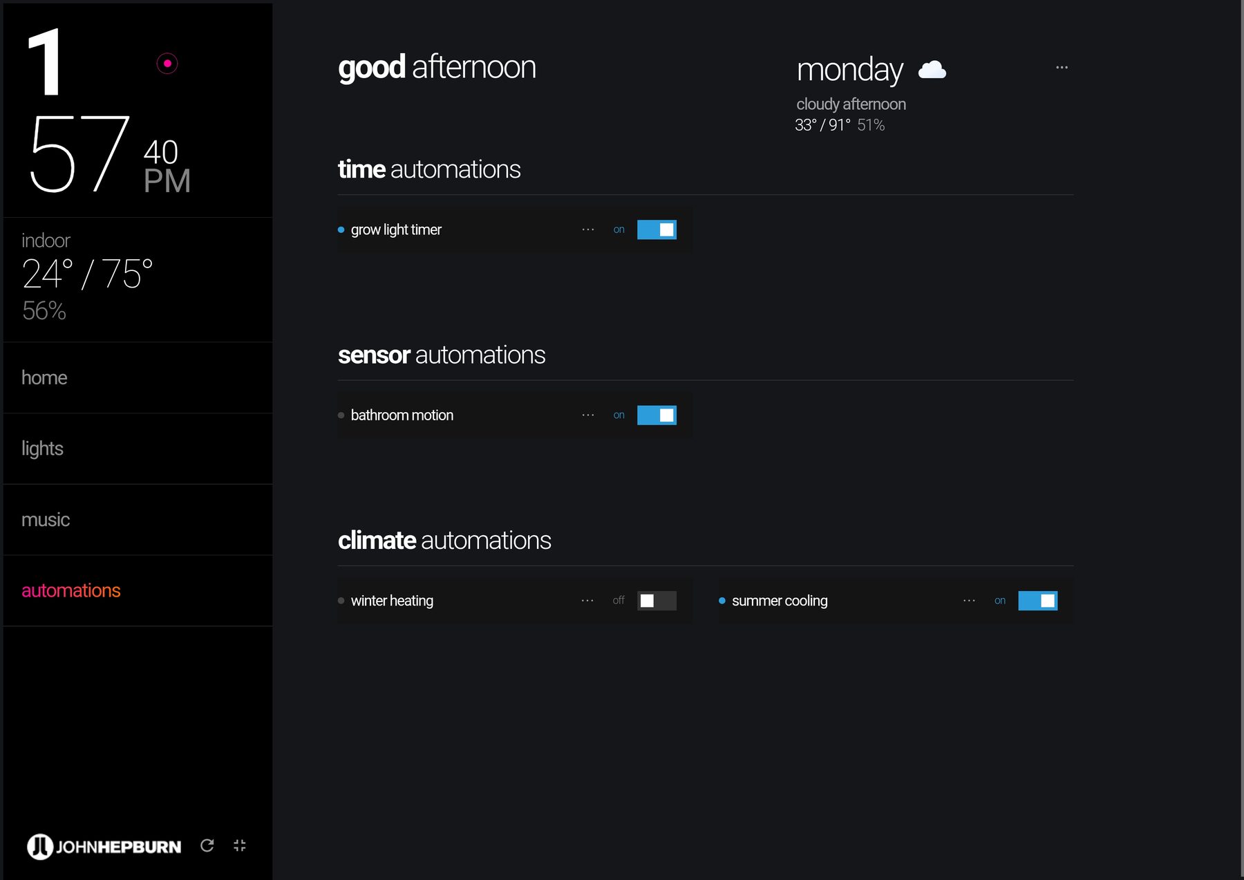
Home Assistant became the integration hub; the custom dashboard became the family’s single point of contact. Climate for every unit with per-room control, whole-home lighting grouped the way the rooms actually work, scenes, automations with visible state, accurate local weather from a custom-built forecast integration — and the entire music system. Nothing requires knowing which brand made which device.
Temperature displays in both units, everywhere it appears — my wife reads Celsius, I read Fahrenheit, and the interface simply respects both instead of making one of us do arithmetic.
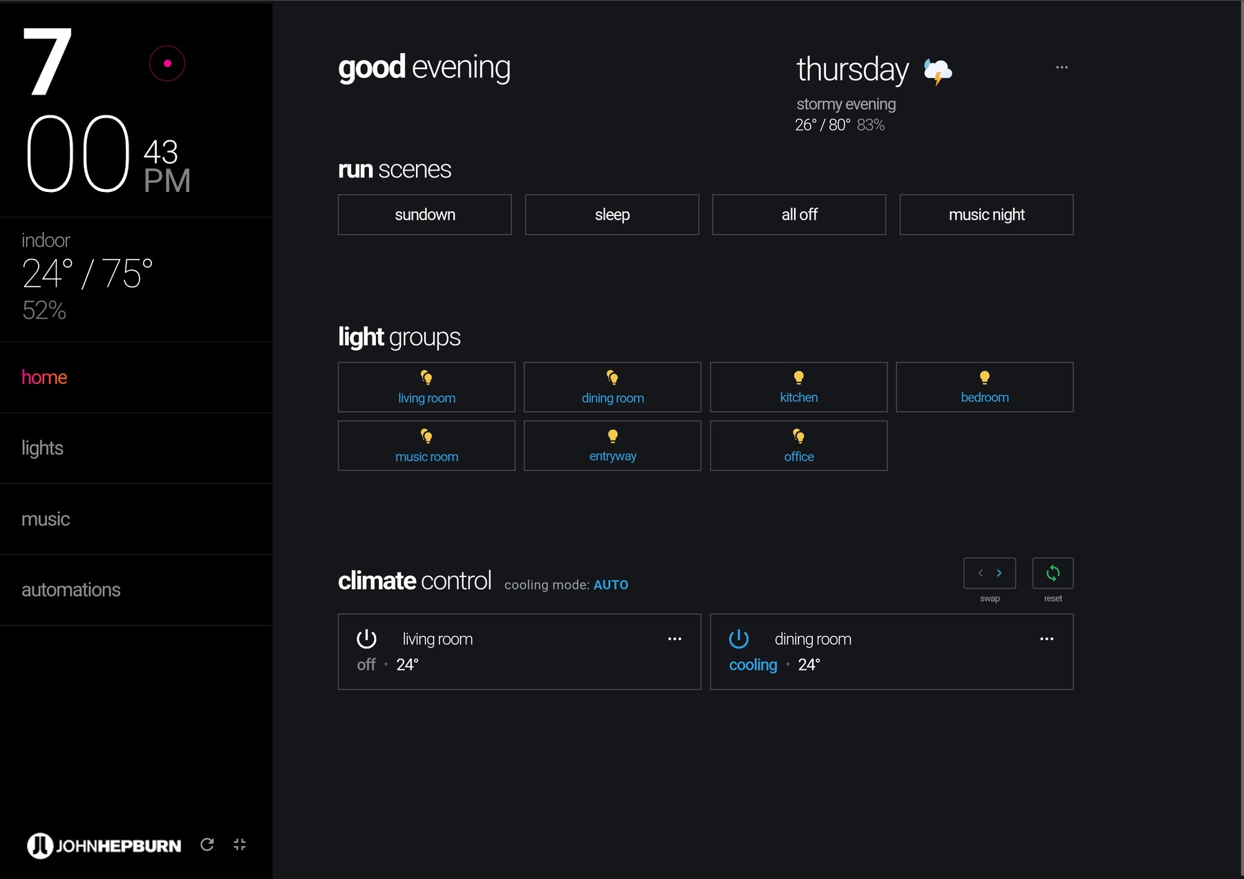
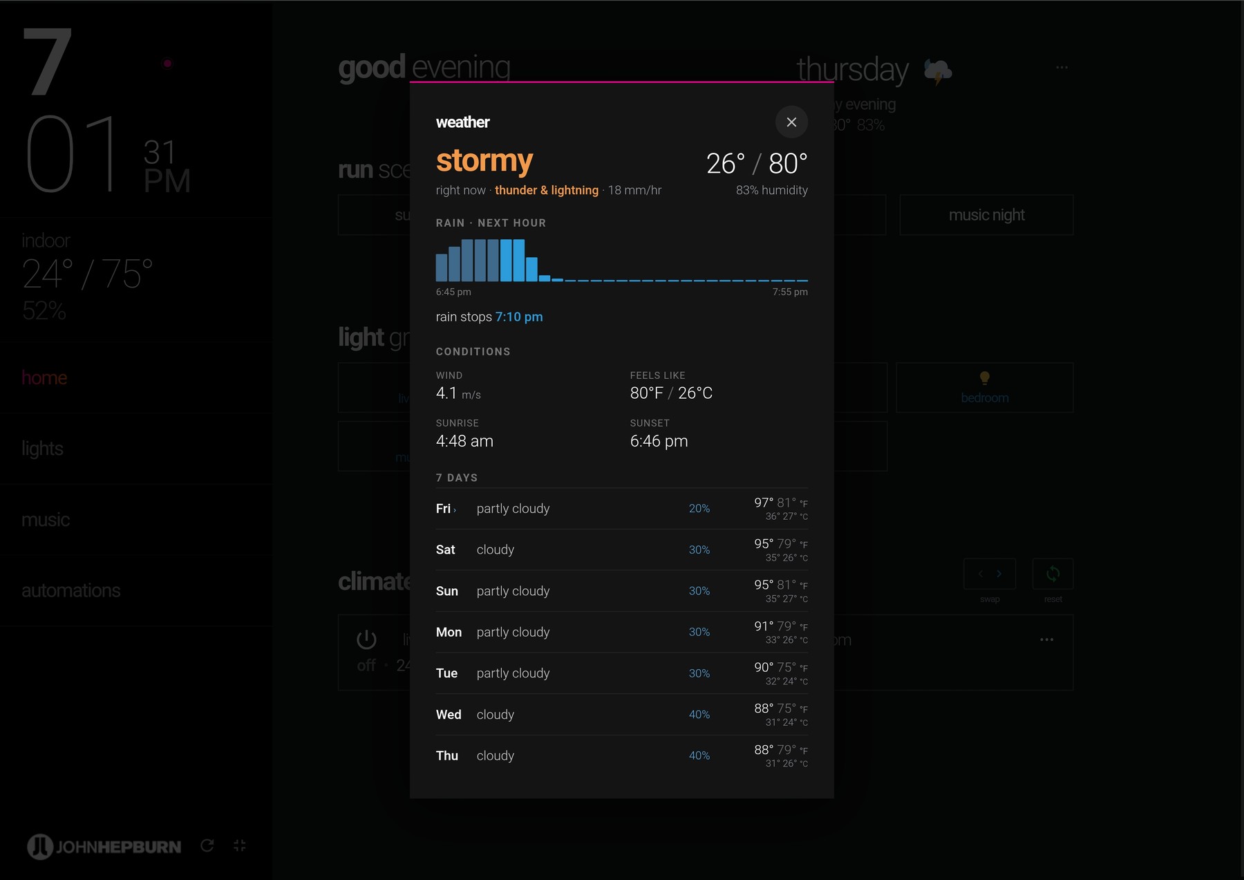
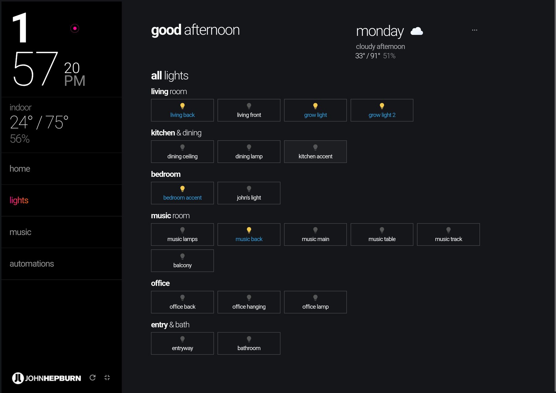
02 — A design language, not a template
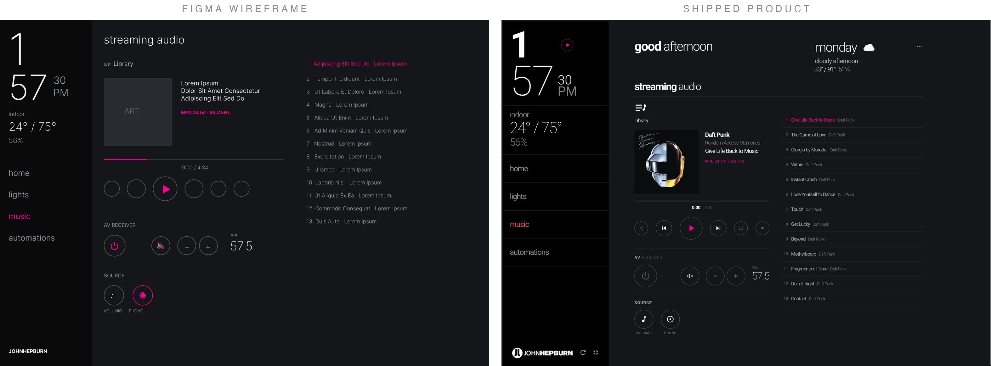
Figma first, dark by design
The interface was designed in Figma before a line of code — a dark, typography-led language built for a screen that lives on a wall: readable across the room, calm at night, thin uppercase display type with a single accent color for state. Every control gives immediate feedback — an optimistic visual response plus a subtle audio cue — and long-press reveals detail views for anyone who wants more than the surface.
Dashboard templates exist and they all look like dashboards. This looks like the apartment it lives in.
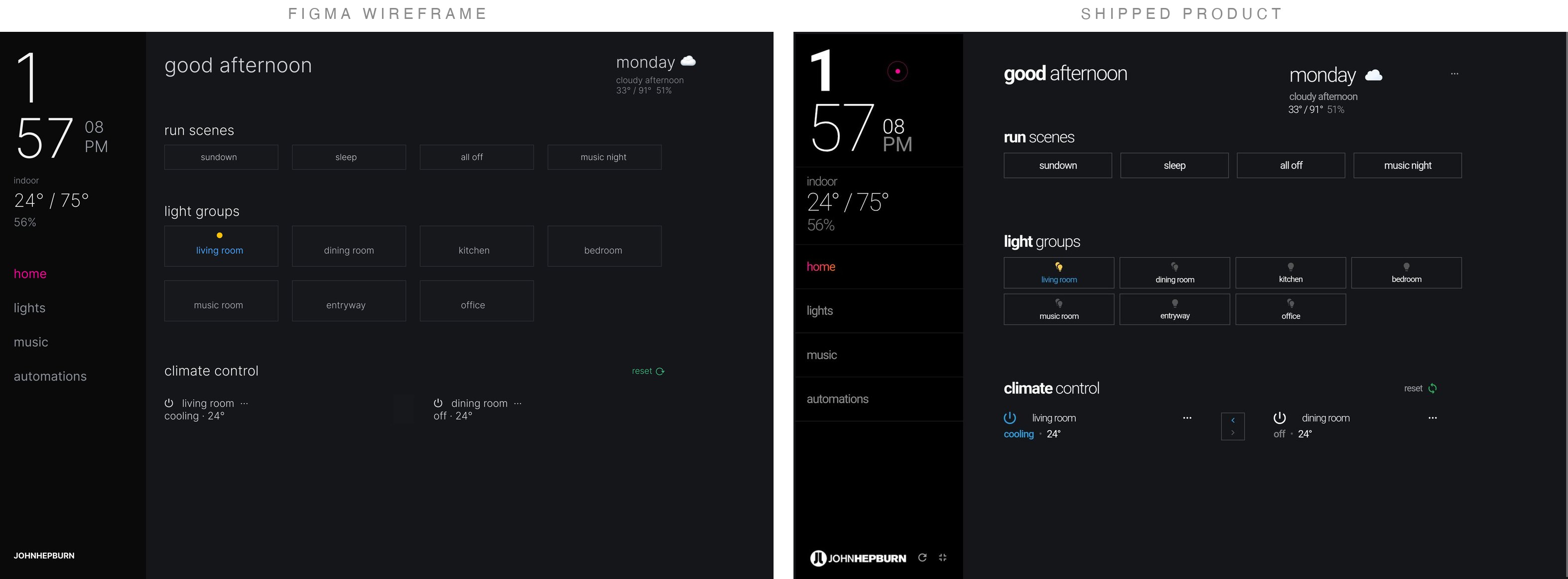
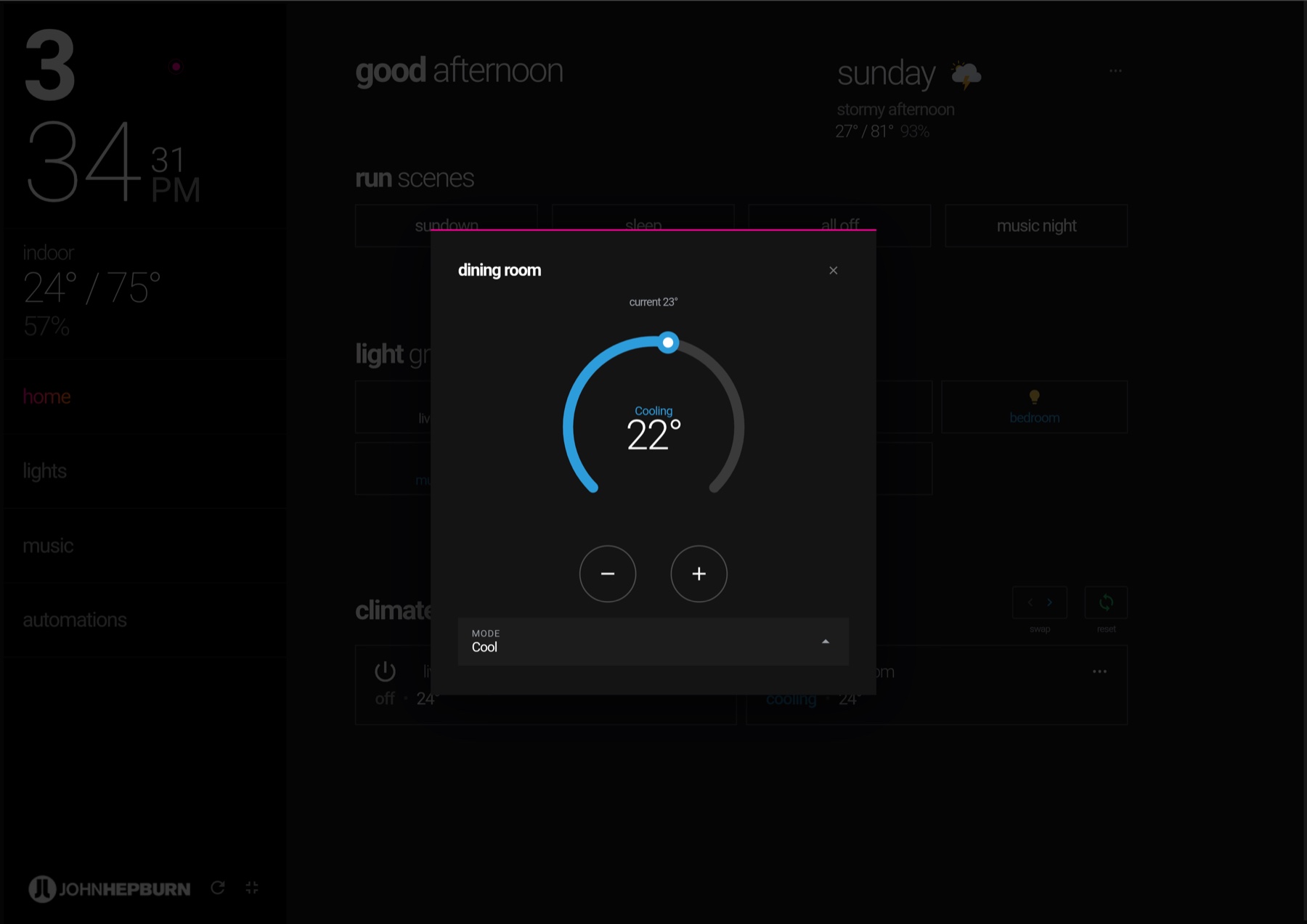
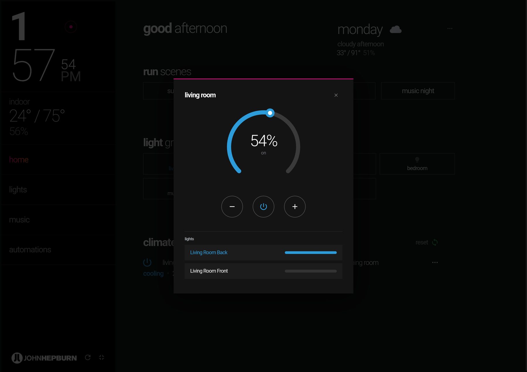
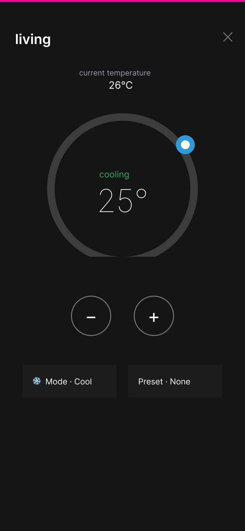
Progressive disclosure: long-press opens detail — a climate dial with mode control, a group dimmer with per-light overrides.
03 — Music as a first-class citizen
Streamers, a turntable, and one volume knob
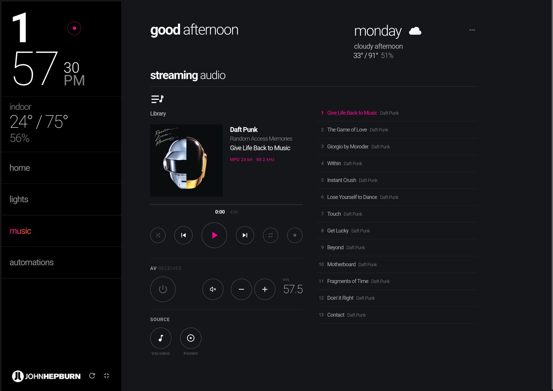
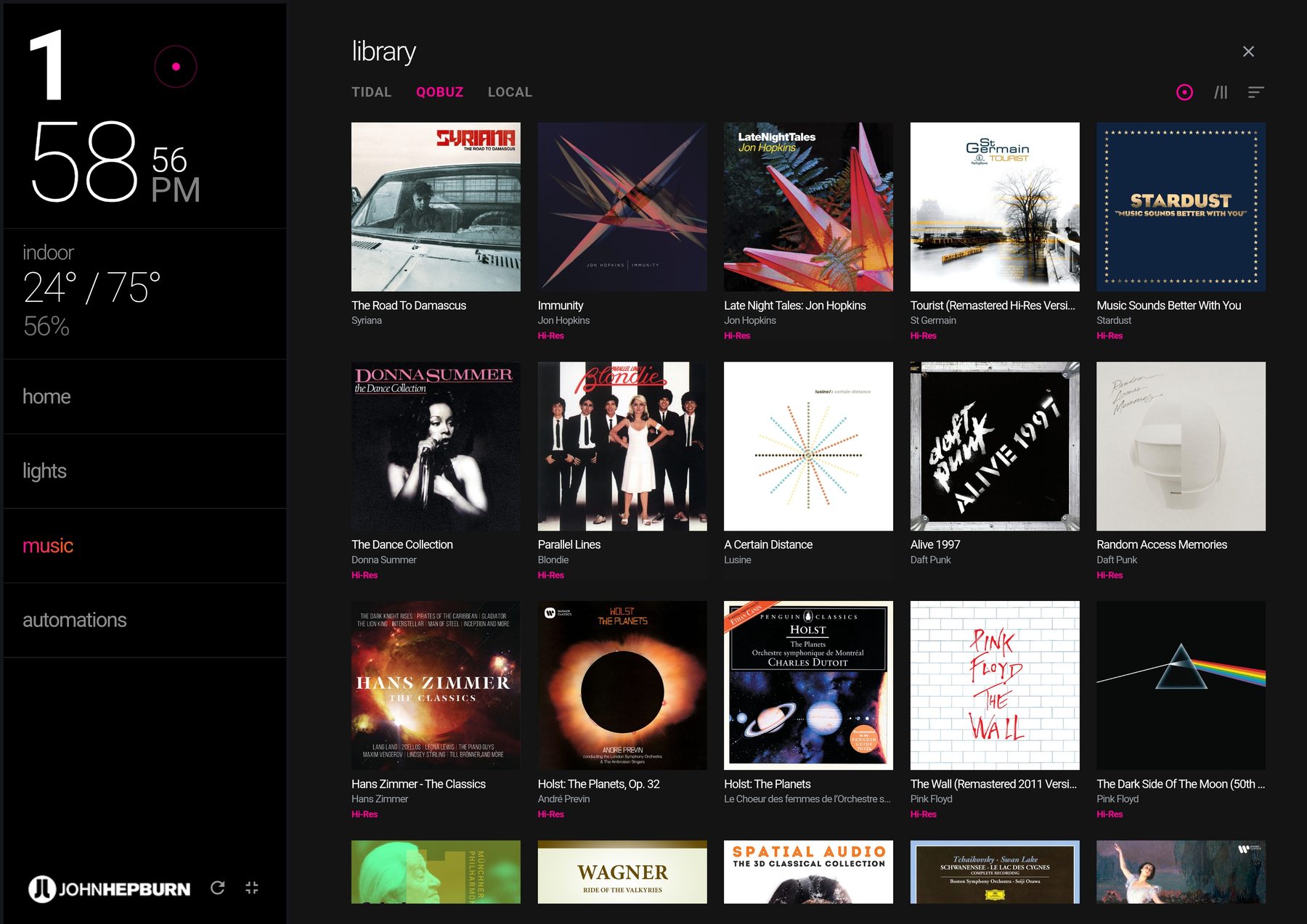
The music page carries the full chain: now-playing with artwork and hi-res badges, a live queue, a library browser spanning two streaming services and local storage — and the amplifier’s controls beside them: press-and-hold volume ramp, mute, and one-tap source switching between the streamer and the turntable’s phono stage. Selecting an album never blasts music unasked — it cues it, ready to play.
Everything is optimistic: the interface updates the moment you act and reconciles with the real device state behind the scenes, so a slow cloud link never makes the room feel broken.
04 — Engineering for trust
Reliability is a design feature
The user problem that kills home dashboards is state that lies. A cloud integration that silently goes stale means a tablet that shows lights on when they’re off — and a family that goes back to wall switches forever. So I treated reliability as part of the UX.
- A watchdog for stale state.A hybrid push-plus-poll connection detects when device state goes stale and recovers it — what you see is what’s real.
- Every surface gets live data.Server-side proxies so every screen, including the phone over the internet, reads the same live state — past the mobile browser’s block on direct device connections.
- Overrides you can see.The automation architecture was redesigned around per-device manual overrides, after the original design allowed a failure you couldn’t see.
- Built to run unattended.A wall tablet has to run for months without being explained, refreshed, or apologized for.
I spent weeks on a watchdog most people will never notice — because a home dashboard that lies to you once is dead forever.
05 — The stress test
One real typhoon
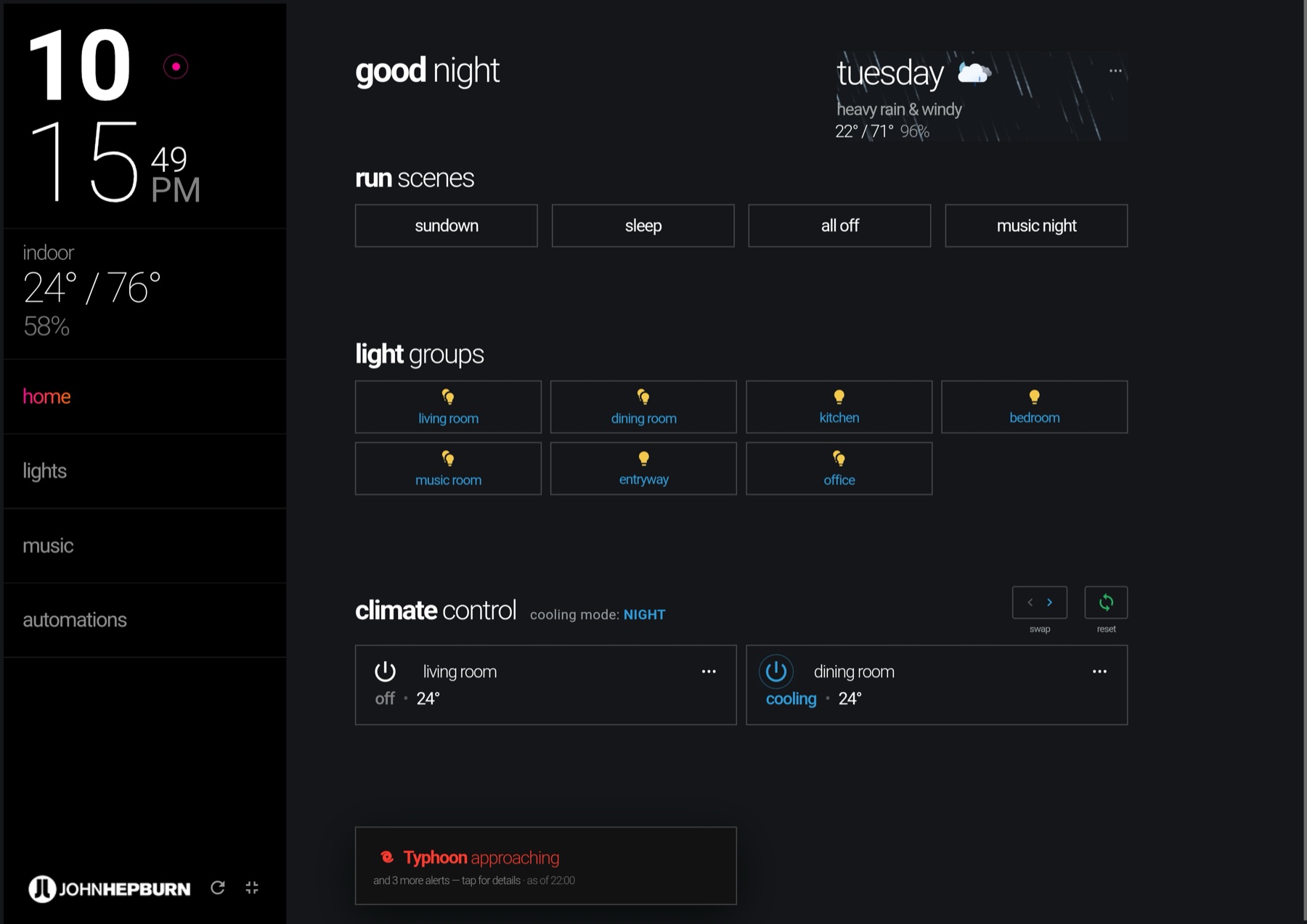
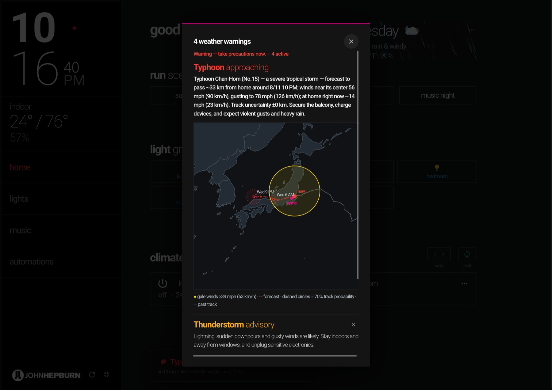
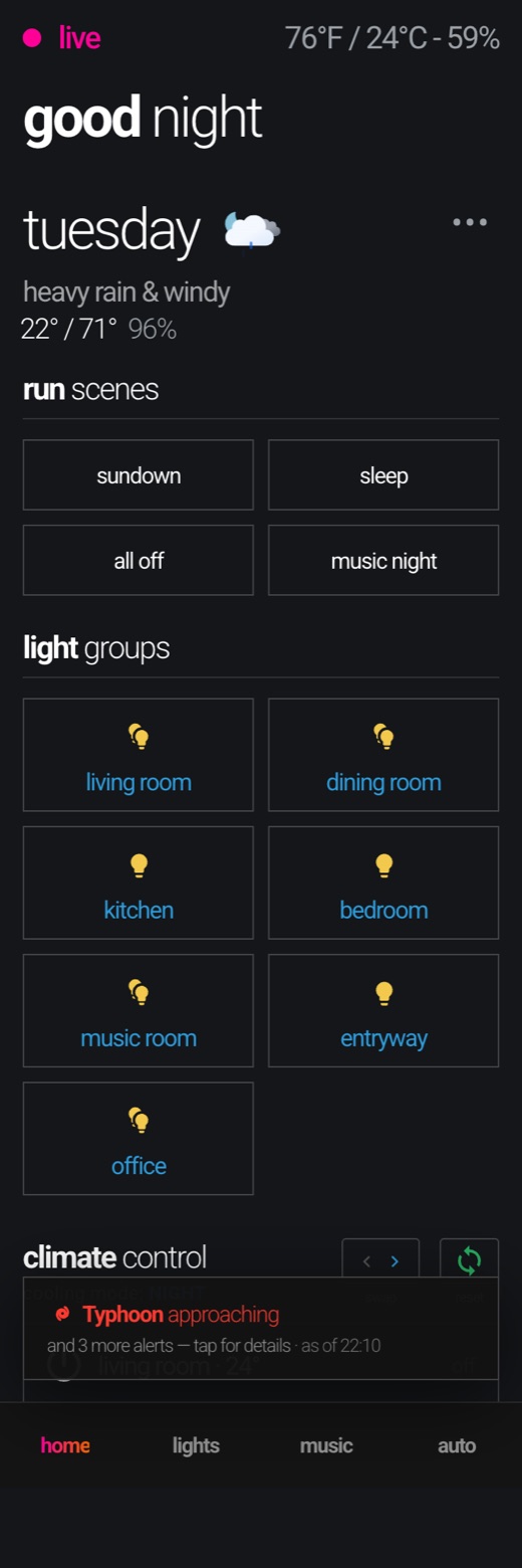
On the night of August 11, 2026, Typhoon Chan-hom passed thirty-three kilometers from this apartment — and the dashboard got the test no prototype can fake. The typhoon warning system on these screens — the days-ahead alert, the track map redrawn in the house design language, the escalation that starts pulsing when the storm is close — was designed, built, and argued over that same week, and photographed here live, mid-storm, with real rain on the glass.
The storm didn’t just test the system; it redesigned parts of it. Mid-evening, watching the display disagree with the window, I rebuilt the weather language live around one rule: the interface may only claim what an instrument observes. Rain from the gauge, wind from the anemometer — “heavy rain & windy” on these screens is not a forecast, it’s a measurement. Warnings speak to risk; the display speaks to fact.
- The one alert you can’t swipe away.Every warning on the board dismisses with a tap — except a live typhoon. That decision was field-tested within the hour, by family.
- A forecast you can read at a glance.The track map answers the only questions that matter — where is it, where is it going, when — in the interface’s own language, not a weather bureau’s.
- Language that de-escalates itself.“Typhoon warning” days out, a pulsing “approaching” at its closest, “moving away” after it passes — then the alert removes itself. No one has to clean up after the storm.
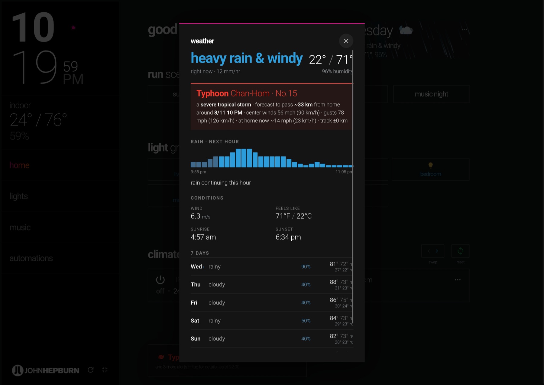
The same three surfaces on the phone — one responsive codebase, so the person sheltering in the bedroom reads exactly what the wall in the living room says.
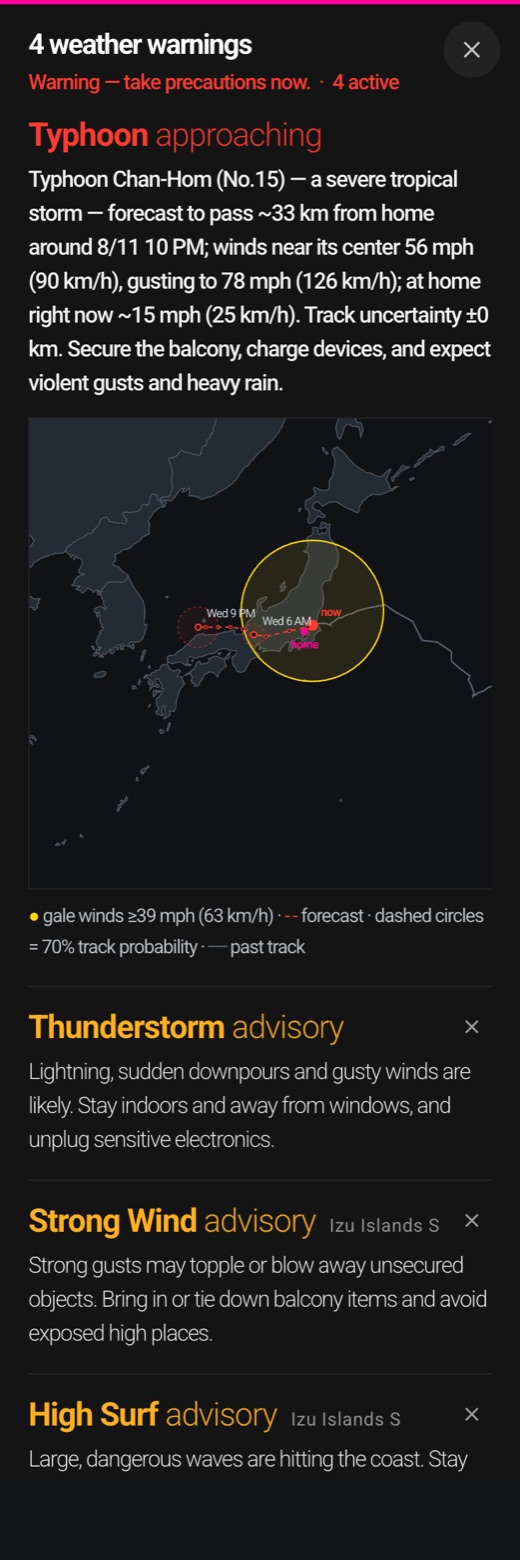
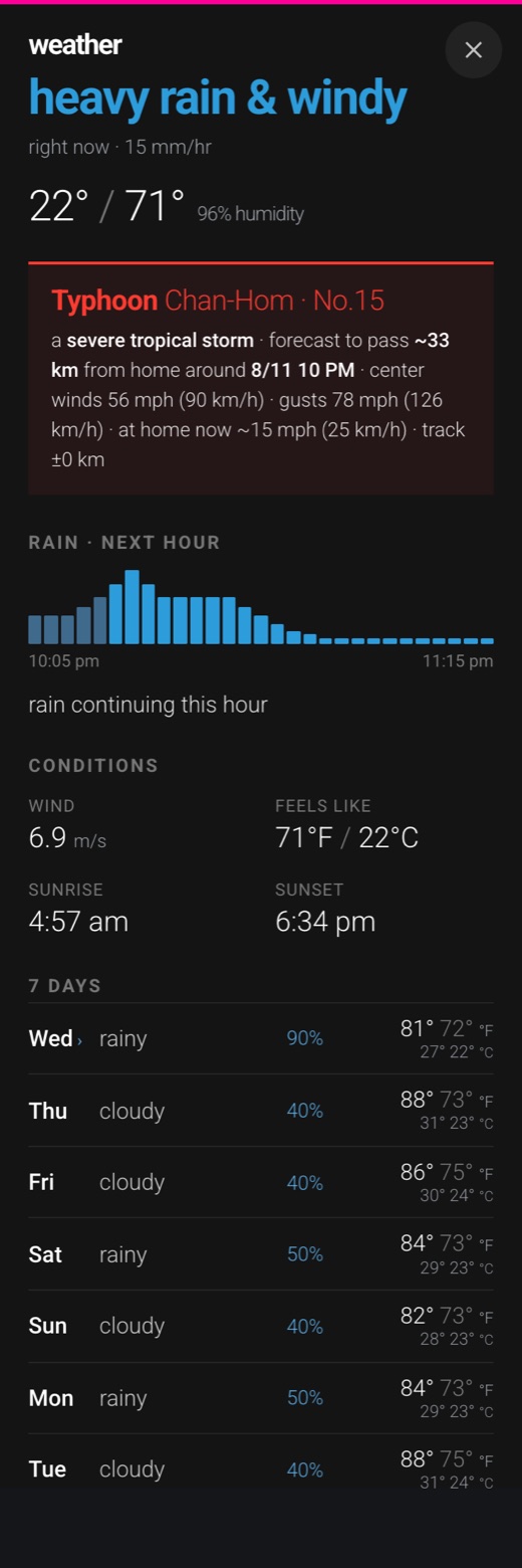
The one warning you can’t swipe away is the one that matters.
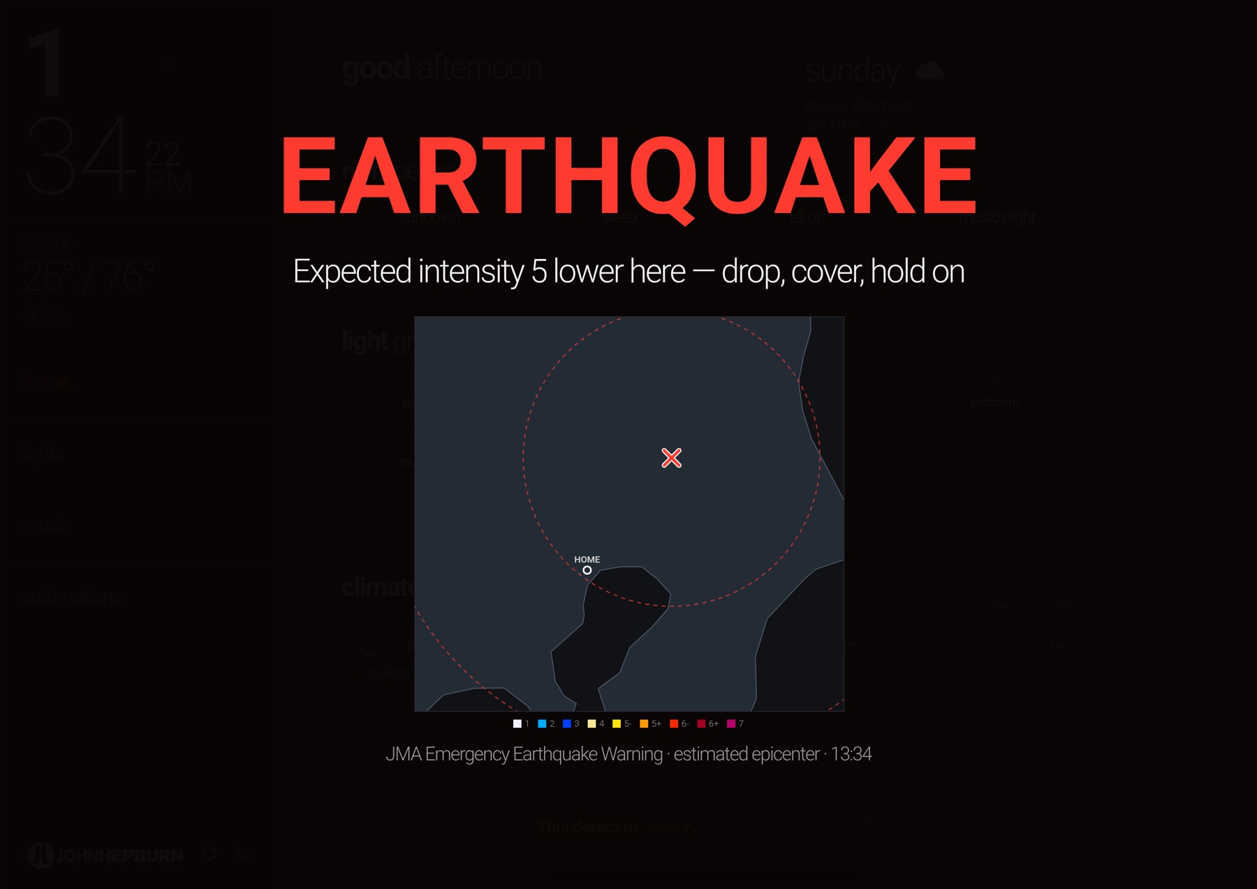
One real earthquake
Alongside the typhoon system — which works in days — the board watches for the threat that works in seconds. A live connection to the JMA emergency-warning stream drives a full-screen alarm designed to arrive before the shaking does, and a seismic map drawn in the interface’s own language. The whole chain is drilled against the real thing: siren, warning screen, and the map replaying a real magnitude 5.9 from 1,299 observation stations.
- The one sound allowed to wake the house.Every other alert on the board respects quiet hours. The earthquake siren deliberately does not — the single exception, earned by a threat measured in seconds.
- If you can’t feel it, you won’t see it.A quake somewhere in Japan is news; a quake here is a warning. The board only sounds for shaking measured at this address — the opposite of a weather app crying wolf from three hundred kilometers away.
- Estimate first, evidence after.At warning time the map draws an estimated epicenter and range rings — honest about how little is known in those first seconds. Minutes later it redraws itself from measured station data. The display never claims more than the instruments have said.

06 — Three screens, one interface
Tablet, desktop, phone
The interface is one responsive codebase — the wall tablet’s layout, the desktop’s, and a phone experience designed mobile-first in Figma with a bottom tab bar, running as a home-screen web app. Same features, same design language, same single source of truth — sized to the hand, the desk, or the wall — because a home interface only stays trustworthy when every screen tells the same story.
And it isn’t bound to the apartment. It runs on the local network and, through Nabu Casa’s cloud relay, from anywhere — so the same phone that dims the lights from across the room does it just as well from the other side of the world.
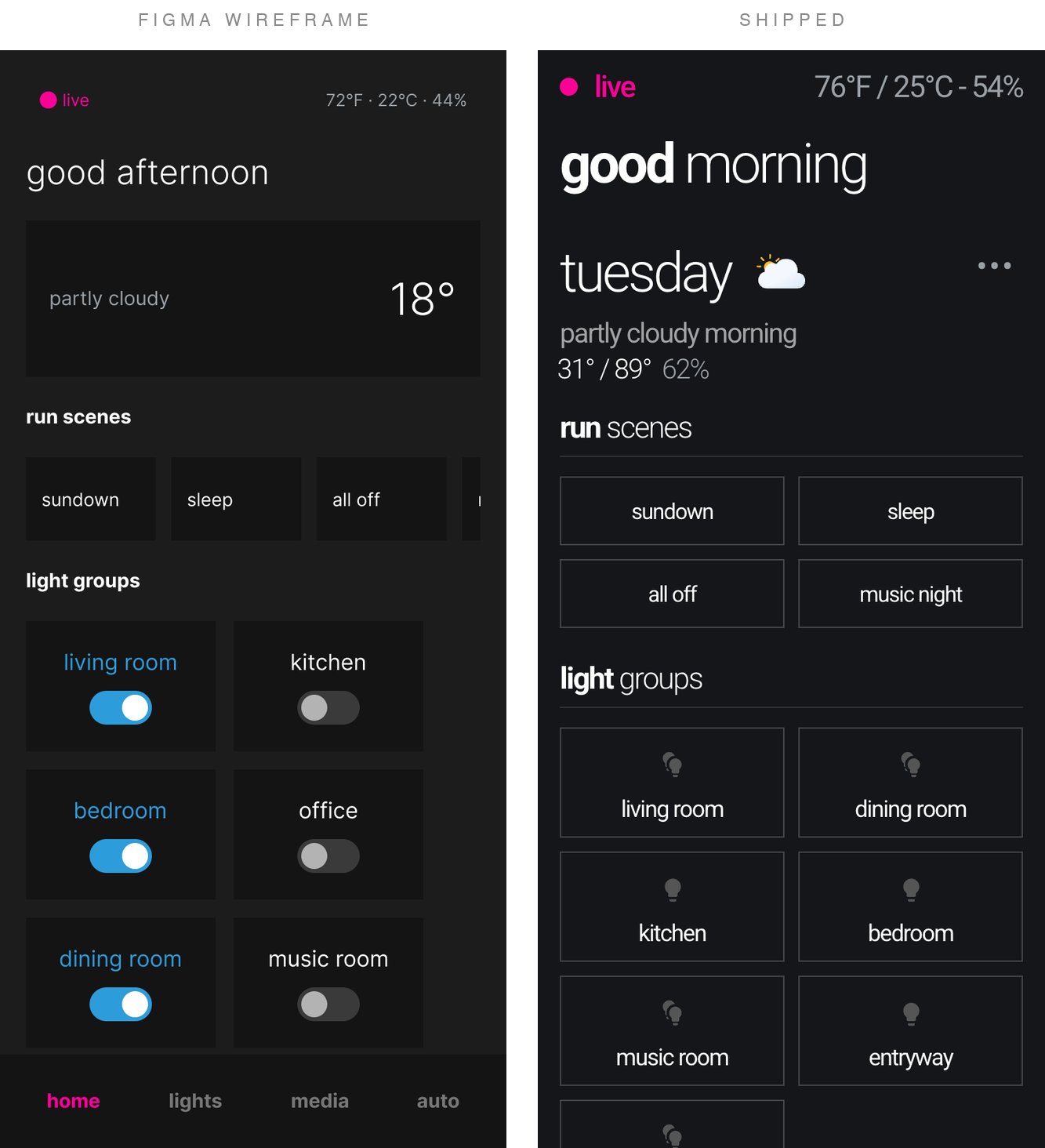
There is no design-system page behind this project — the wireframe set is the working documentation. Here is the mobile spec in full: the four views, the tertiary flows, and the long-press popups, exactly as they were drawn before the code existed.
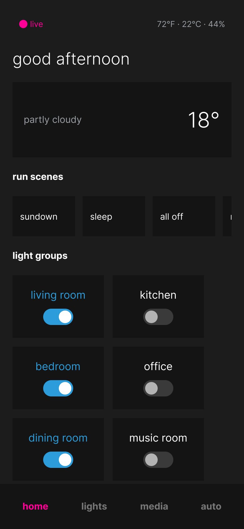
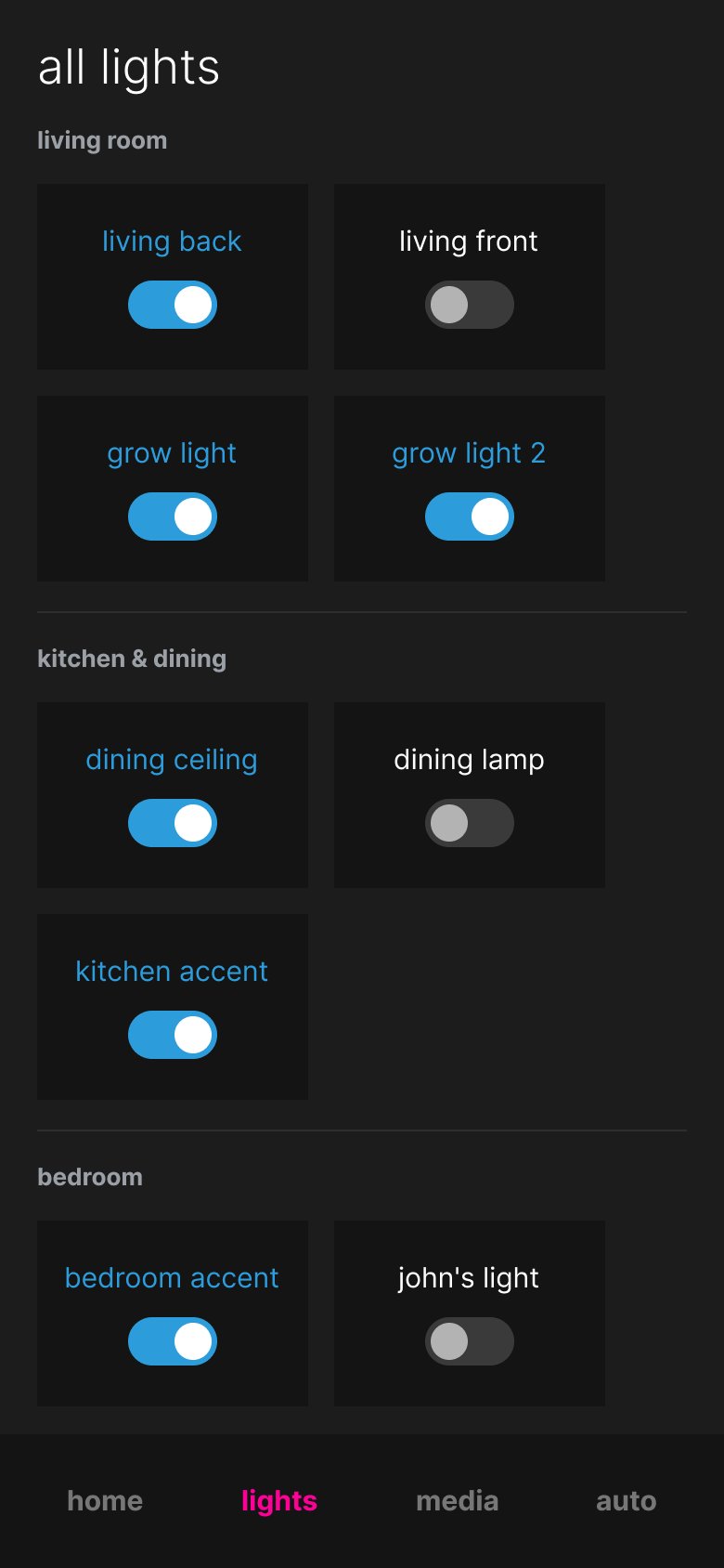
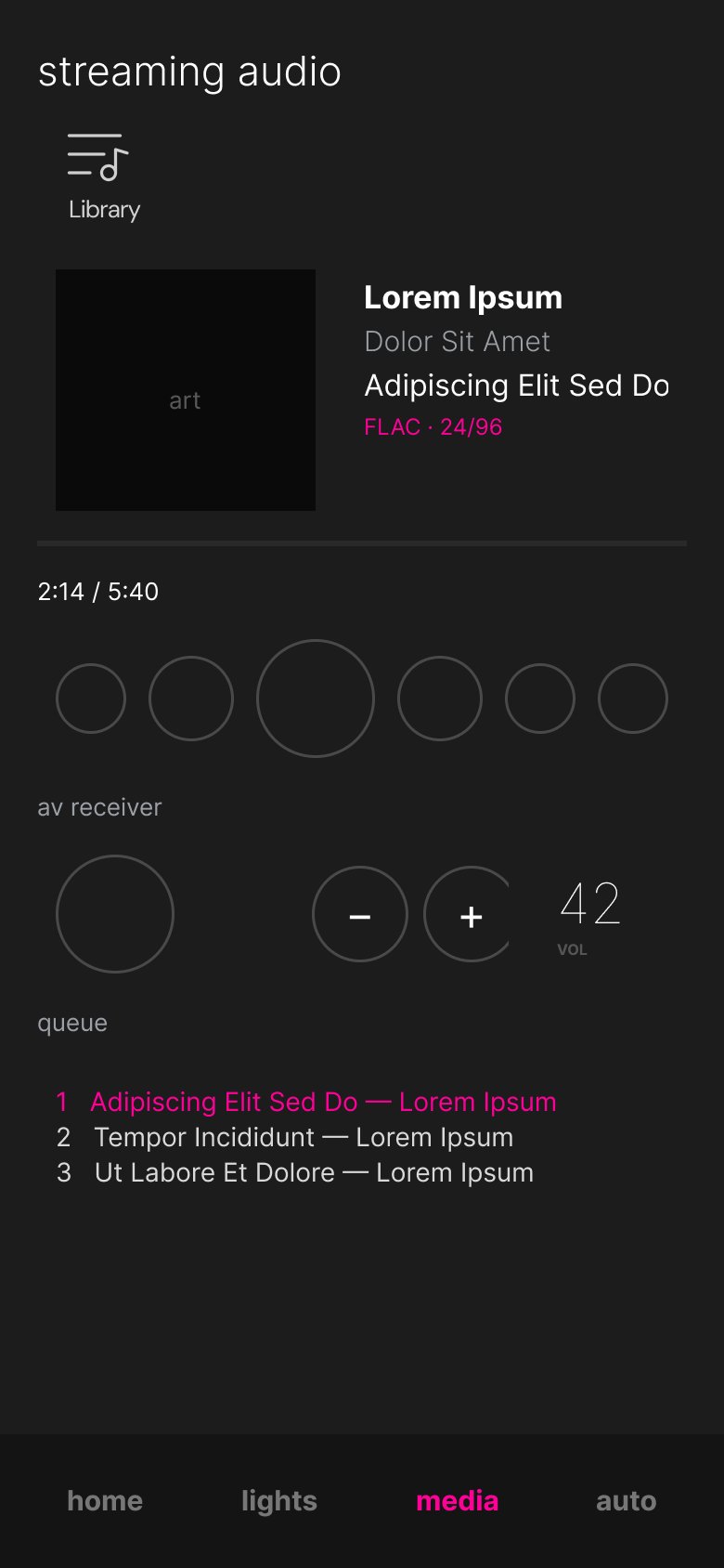
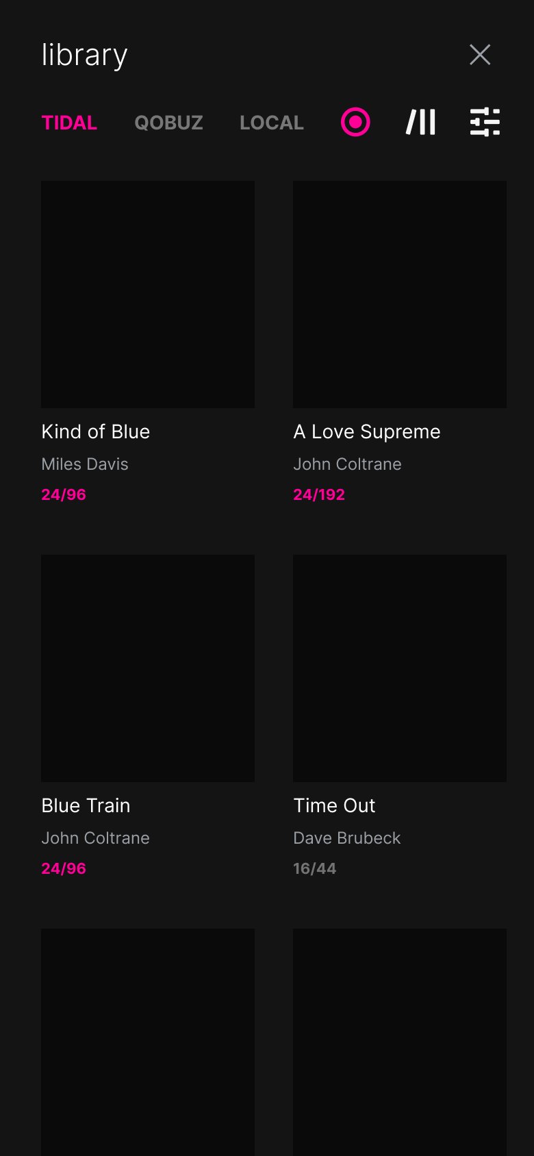
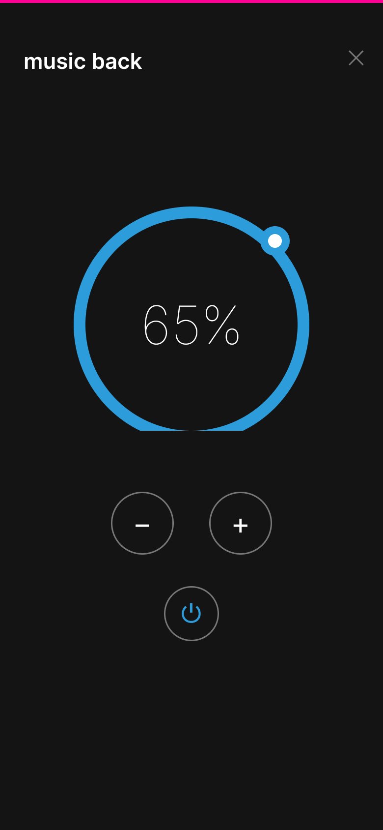
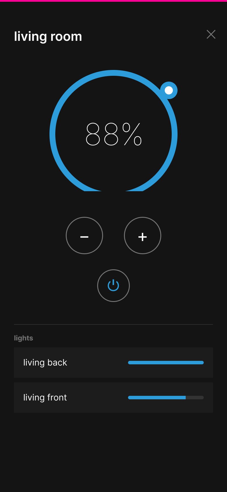
The mobile spec in full — views, tertiary flows, and popup explorations, warts and all.
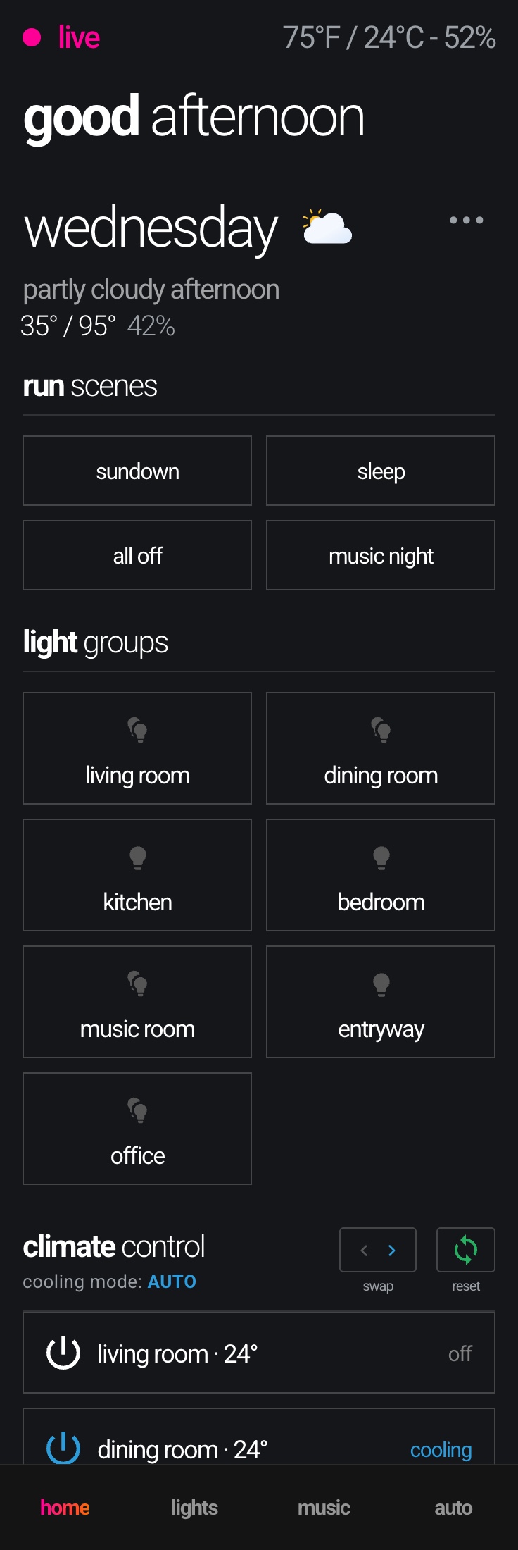
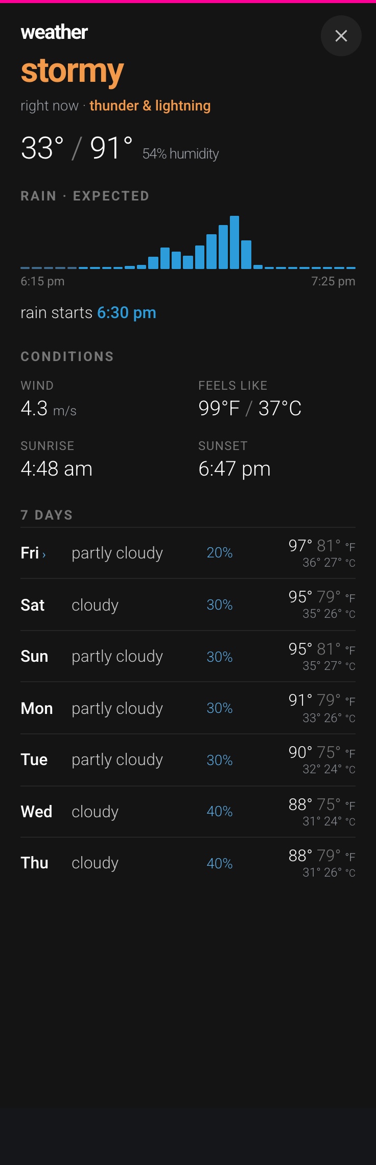
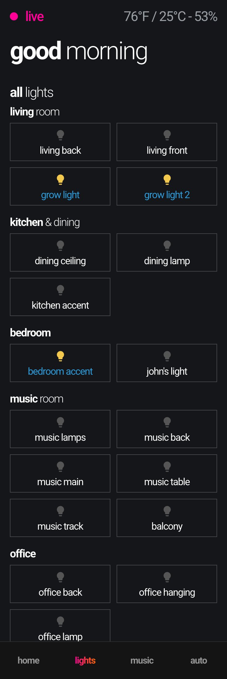
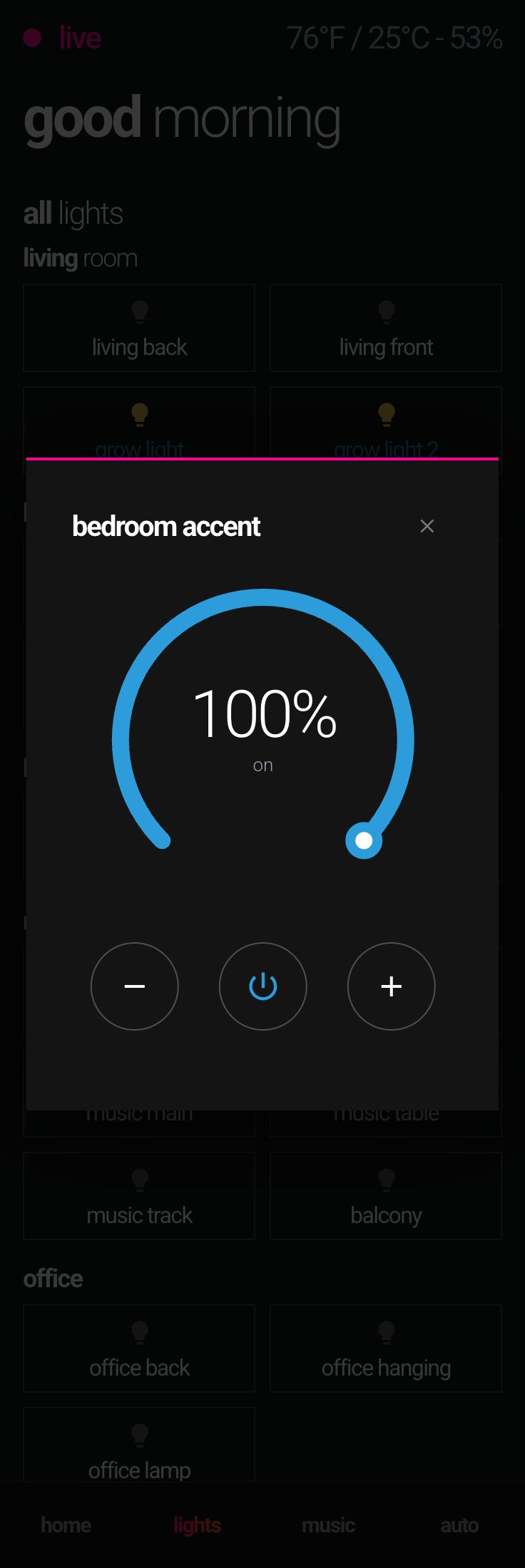
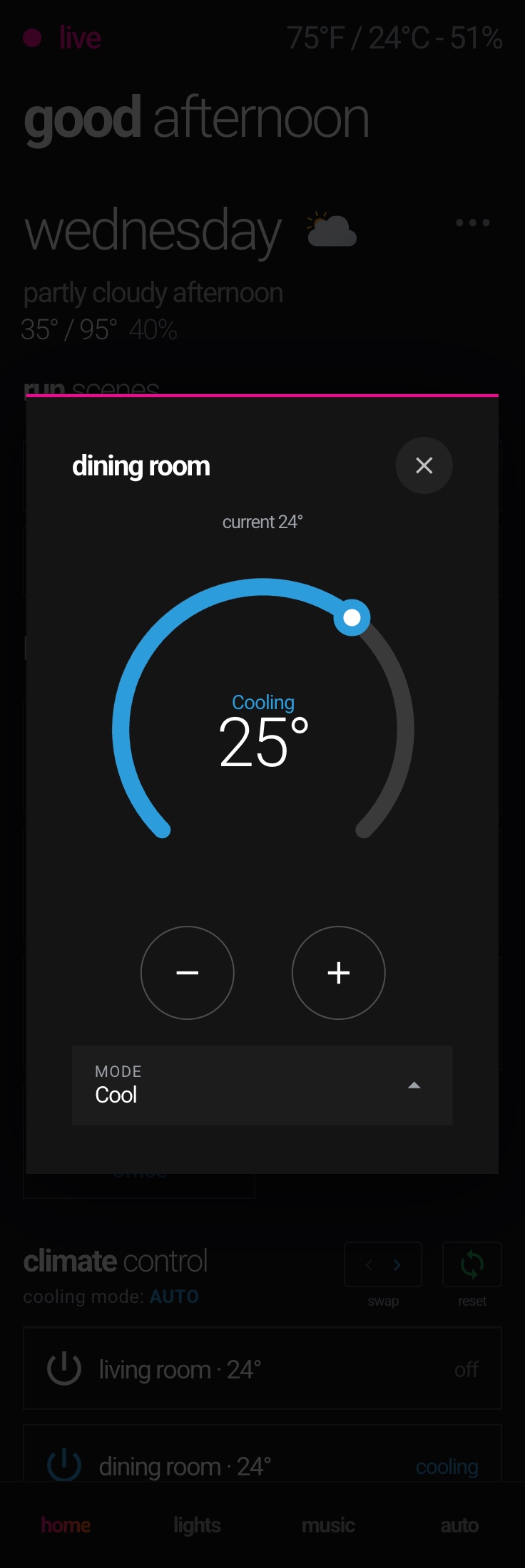
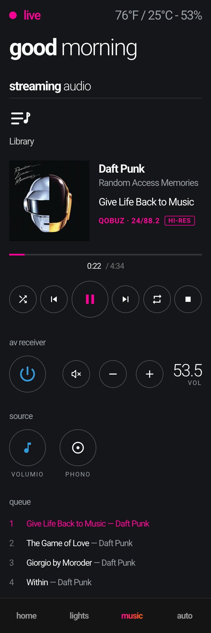
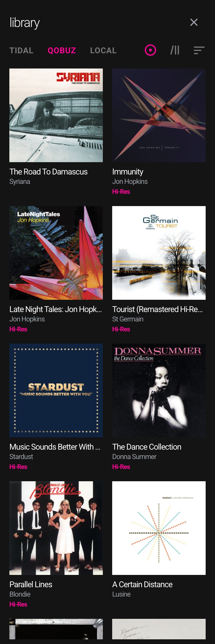
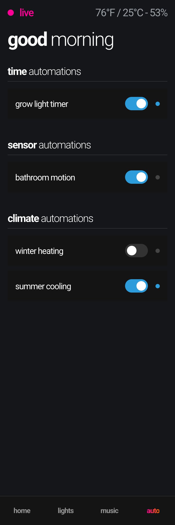
The phone experience, full length — home and the custom weather sheet; lights with its long-press dials; music and the library; and automations to close.
07 — A remote for a two-year-old
The video tab: YouTube, playlists, and a TV that keeps its promises
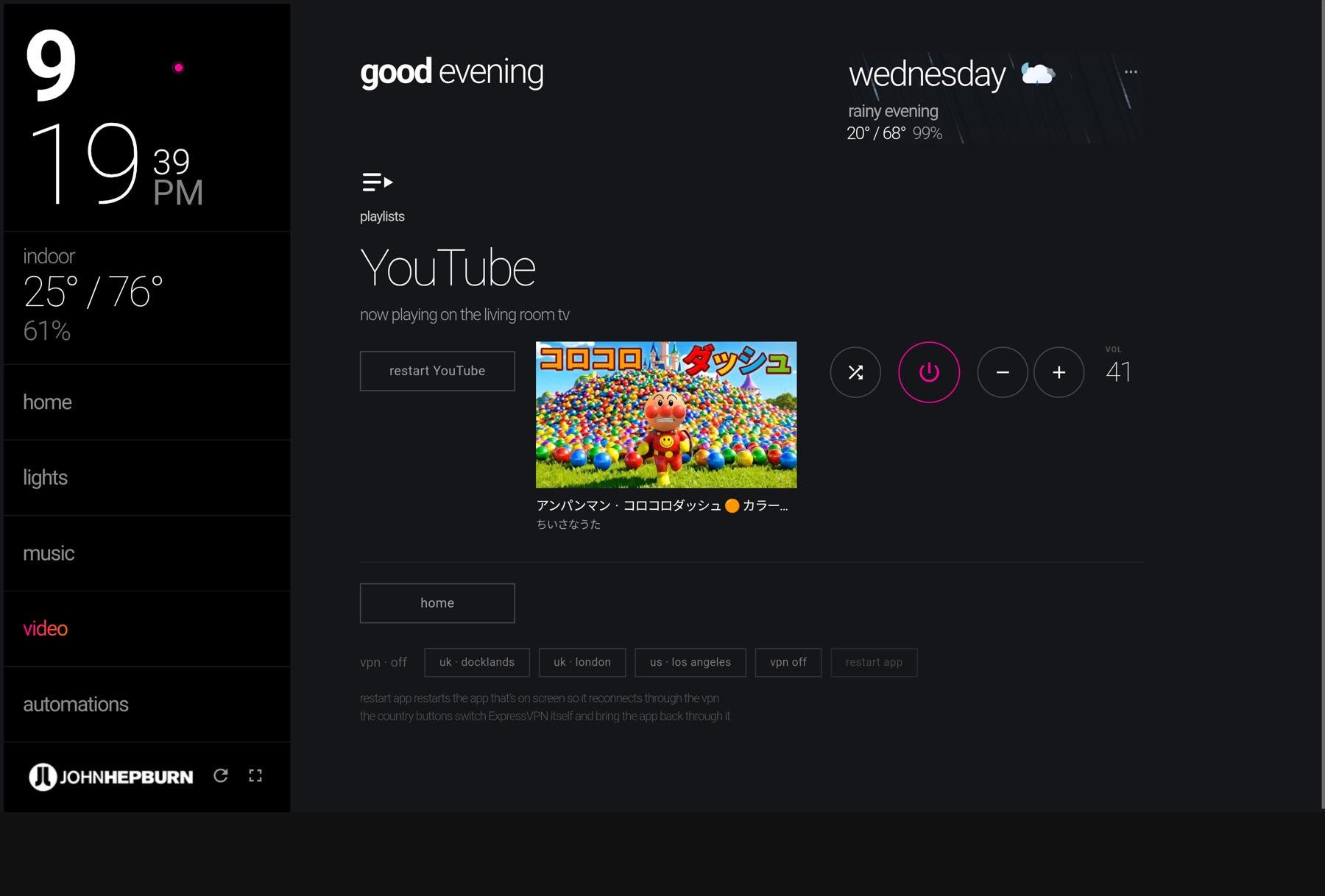
This one is niche by design. My daughter is two, she has firm opinions about Anpanman and Mickey Mouse, and the family had a ritual that was not working: switch on the set, pick a profile, hunt through “recently played” with a remote for the compilation she actually wanted. The TV’s own app is built for adults browsing. What the household needed was a controller for one child’s library, on the wall tablet everybody already uses.
The tab talks to the set over a debug bridge rather than a cloud service, which is what makes it honest. The hero is a true now-playing tile: the television itself reports the title and channel of whatever YouTube is showing, whether the tablet started it or someone picked it with the remote, and the thumbnail follows once the video is identified. Power lights the moment you ask for video and yields to the set’s own state; volume ramps while held, with the TV’s real level beside the circles. Every control is the music page’s idiom: circles for device controls, squared type for actions, one accent colour for state.
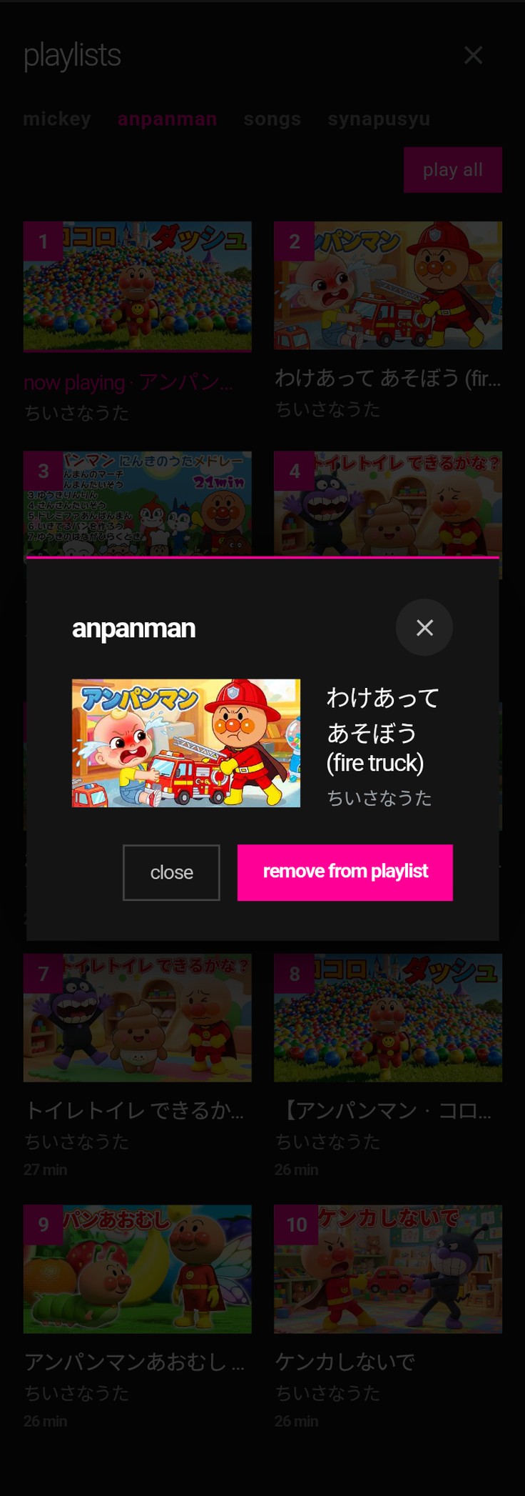
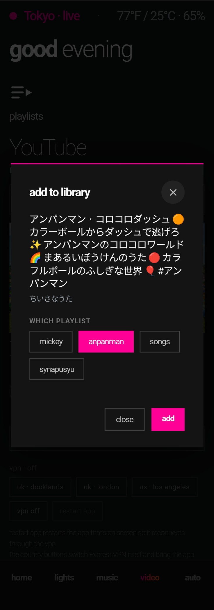
The playlists are ours, not the algorithm’s. Each tab is a curated list; a tile plays that one video and lets YouTube carry on, while “play all” runs the list in order and shows you the queue. Long-press a tile to remove it, long-press the hero to add what’s playing to a list of your choosing, with duplicates refused. A shuffle deals from every list in turn, so the grown-ups on the couch are not sentenced to the same ten minutes on repeat. It is the smallest project on this page and the one that gets used every single day.
- Only claim what the set observes.The tile is built from the television’s own media session, polled every twenty seconds. When the set is off, the tab says so; it never guesses.
- Optimistic, then honest.Power, shuffle and play-all light up on the tap and settle to the device’s reported state within a bounded window, the same pattern the lights and the receiver use.
- Pick up where you left off.“Restart YouTube” relaunches the current video at its position, and from a dark set it resumes the last one, so dinner does not cost the second half of the episode.
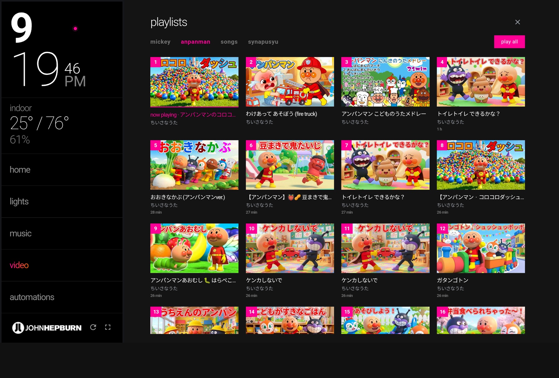
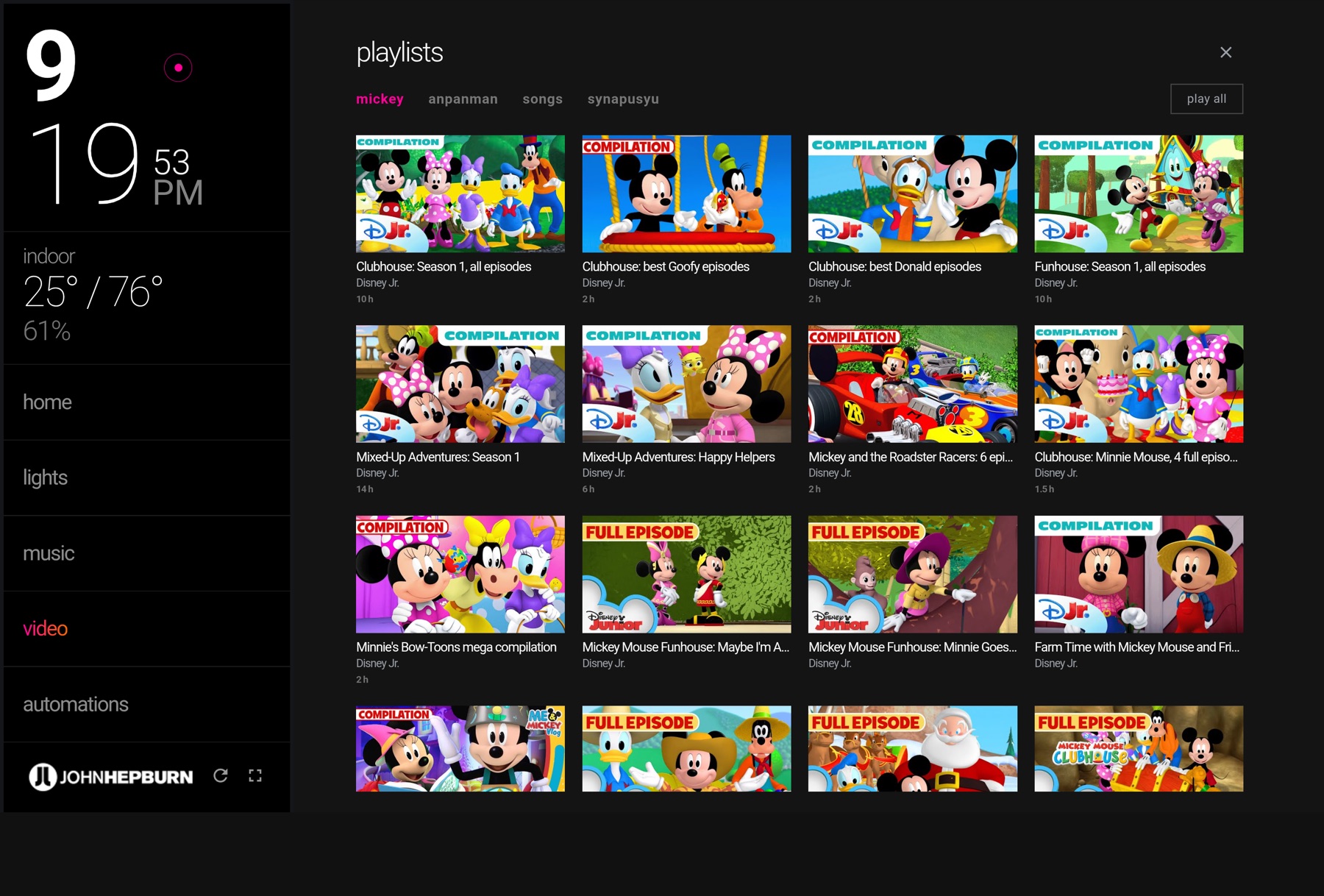
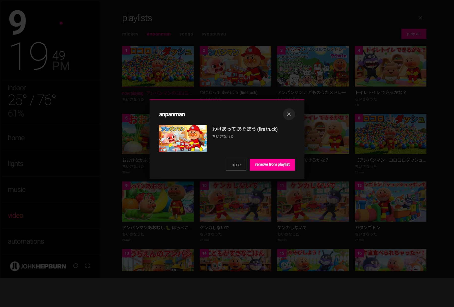
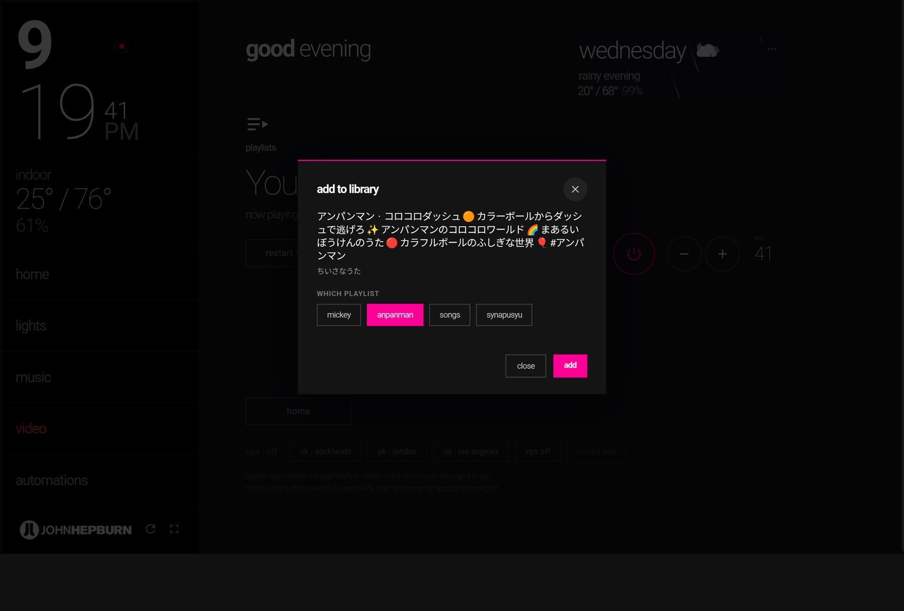
The playlists overlay with “play all” running and the queue numbered; the Mickey Mouse tab; long-press to remove; and adding what the set is playing to a list of your choosing.
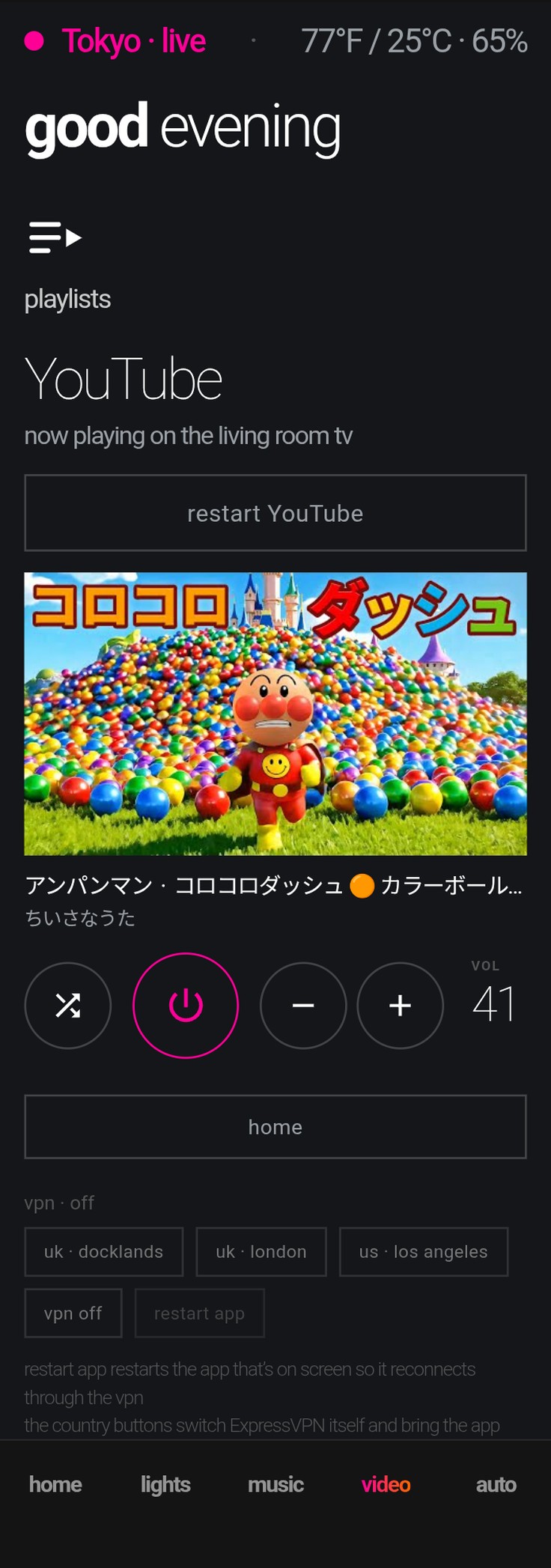
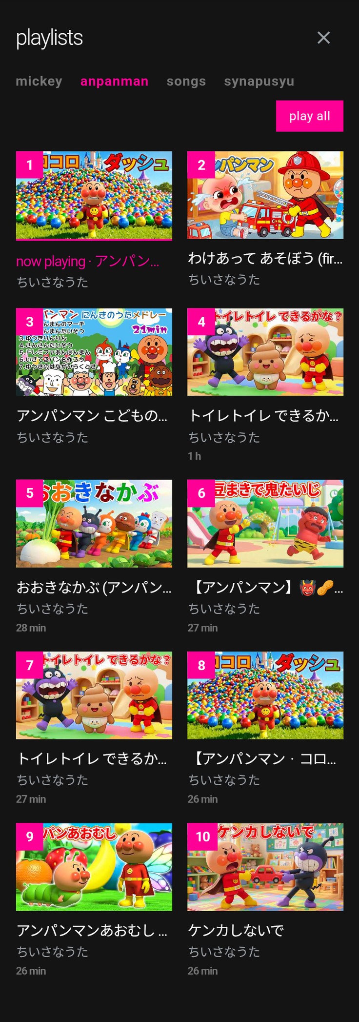
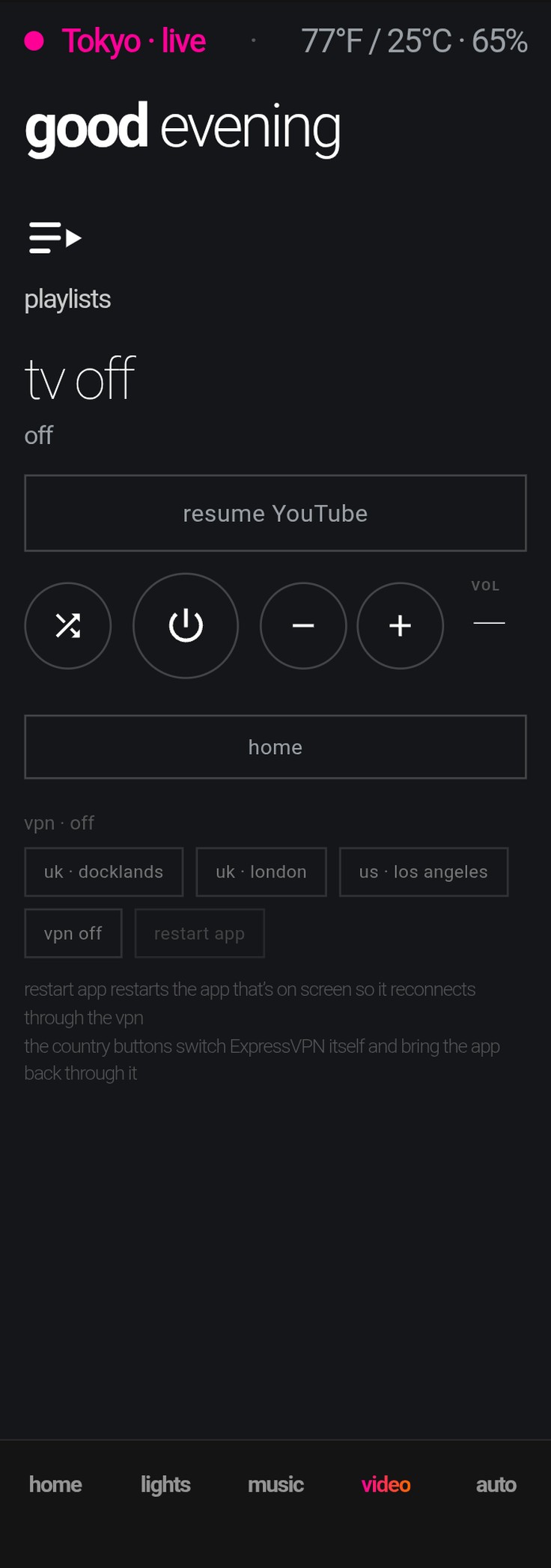
The same tab on a phone: one responsive dashboard, not a second one. The hero stacks, the circles keep their size, and every popup is the same popup.
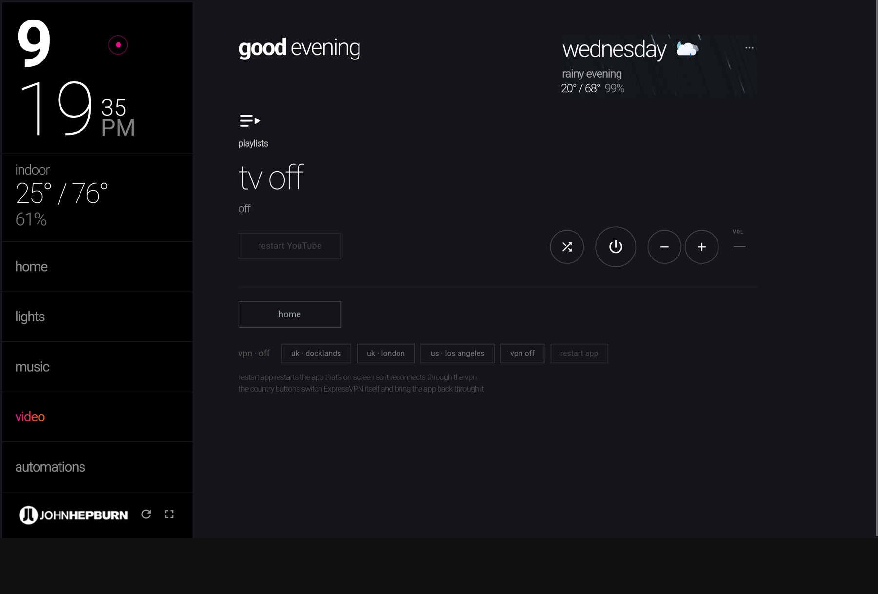
The TV’s app is built for adults browsing. This is built for one child’s library.
08 — Designing with AI
A new tool in an old process
This is the first project in this portfolio built in partnership with AI — and it changed my process less than you’d think, in exactly the right way. The design still starts where it always has: real user problems, a Figma spec as the source of truth, and my judgment on every pixel that ships. What AI collapsed is the distance between design intent and running product.
The loop is fast and conversational: I describe the intent, the AI builds it, I use it on the actual wall tablet, and I critique it like I’d critique any designer’s work — too heavy, wrong weight, doesn’t match the spec, users won’t find that. Iterations that once took a sprint take an afternoon. And the partnership runs deeper than pixels: the reliability engineering above — the watchdogs, the proxies, the failure analysis — was debugged the same way, out loud, together.
That pairing is what feels genuinely new. AI can build almost anything you describe — but it doesn’t know when a thing is right: when the weight is off, when a screen looks finished but doesn’t feel it, when a user’s eye won’t land where it should. Knowing what looks right and feels right — what makes a user’s eye happy — is what two decades of the craft buys you. Put that eye next to something that builds as fast as you can describe it, and you get further than either would alone — the judgment to know what to make, and the speed to make it.
AI didn’t design this interface. It let me build it.
The loop closes
The house tells me what to build next
A home interface is never really shipped — it’s lived in, and living in it is the research. What the family reaches for, where a guest hesitates, the device that shows up and demands a place: that’s the feedback, and it comes back to me as the next brief.
- 01They live with itFamily daily, guests cold, every room
- 02I watch what they reach forWhat works, what they fumble, what’s missing
- 03It earns a placeBlinds, sensors, the next device — in the same language
Nothing gets bolted on. When a new device arrives, the question is never “which app?” — it’s “when does it go on the tablet?” The people living with it write the next version by using this one. The house keeps telling me what it needs next.
The tools changed completely. The craft hasn’t moved an inch.Find the real problem, design for trust, iterate with the people who live with it — held from hand-drawn wireframes all the way to building with AI.
Outcome
A home that finally behaves
It has run for months as the household’s primary interface — and when something new arrives in the apartment, the question is no longer “which app?” but “when does it go on the tablet?” It’s never really finished: a living, evolving interface, built to scale — as more lights, automated blinds, and new systems come online, each one earns a place in the same language rather than another icon on the pile.
My earliest case studies here were drawn by hand, before Figma existed and long before AI. This one closes the loop: designed in Figma, built in partnership with AI as an engineering collaborator, refined the same way as ever — by listening to the users who live with the result.
6
ecosystems, one interface
2
homes running it daily
0
instructions needed by guests