Role
Product Design Lead
Team
Microsoft · Docs.com
Platform
Web · Office Online
Outcome
70M+ users in a year
Overview
A home on the web for any Office doc
Docs.com let anyone publish a Word doc, a PowerPoint, a Sway, or a PDF straight to the open web — in full Office fidelity, free, with a link anyone could open. I designed how all of it worked — from the file on your laptop to a page with your name on it.
The origin
The social network Microsoft didn’t have yet
Docs.com was a social network for documents. People could publish, discover, view, download, and share Office files in full high fidelity — Word, Excel, PowerPoint, Mix videos, Sways, images, PDFs, even web links — from a profile page that was theirs. They could follow other authors, form groups and organizations, and decide for each document exactly how open it was: read-only, or free to copy, download, and reuse.
The point was high fidelity. Microsoft wanted to show that every Office product now lived on the web — that a document you made in Office could be showcased online looking exactly as you built it, even if you weren’t editing it there. And Microsoft had no social network of its own at the time, so Docs.com became the professional sharing hub Office didn’t have — a place for professionals, writers, and amateurs to publish their work, share it, and let others build on it. (SlideShare let you post a PowerPoint, but not in high fidelity, and you couldn’t download it and make it your own. Docs.com was about creation, control, and rights — not just posting a file.)
The scope was enormous, and the whole Tokyo team ran at it in weekly sprints. I led the design: the publish flow, the profile, the way people found each other’s work, and the content tile everything else hung off of.
Who it was for
One thing to do, no good way to do it
Underneath every use of Docs.com was the same wish: get a document out into the world — looking right, findable, and without the overhead of a website. It showed up in a lot of forms:
Pain points
- “I need to share this document without emailing a giant file.”
- “I want my report online, looking exactly as I made it — without building a website.”
- “I need my students to get their own copy of this notebook.”
- “I want people to actually find my work, not just have a link to it.”
- “I need one place that’s mine to point people to.”
Three of those people pulled the design the hardest, and each needed the same site to do something completely different.
The educator
Dana, and the lesson the whole class could keep
She teaches from a OneNote notebook she’s spent years building, and she wants more than for students to see it — she wants them to take it, work in it, and build on each other’s work out in the open. For her, amazing is a living resource the whole class can take, add to, and learn from together — free, no login wall, no LMS in the way — the kind of thing that lifts every student, and her along with them.
Dana Alvarez
High-school teacher · 39
“A link they can only look at isn’t a resource. I want them to own it.”
Amazing =A living lesson the class can take, build on, and share back — lifting the whole room, her included.
Goals
- Put a full lesson — and the homework that goes with it — online where every student can reach it.
- Let them take their own copy into their own OneDrive to work in.
- Let students share their work with each other in the open — to help, not to copy.
- Share with other teachers, and see it picked up well beyond her classroom.
Frustrations
- The LMS locks resources behind a login only her class can pass.
- Emailed notebooks arrive broken, or too big to send at all.
- “View only” links mean nobody can actually build on her work.
The moment that matters
- The start of a unit, when 30 students need the same material at once.
- She needs it to be one link that gives everyone their own copy.
The user journey
From a locked-down lesson to a class that builds together
This is Dana’s journey, start to finish — from fighting the login wall on everything she shared, to the day her students were building on each other’s work in the open and teachers from grade school to university were copying her lesson into their own classrooms.
DADana’s journeyHigh-school teacher
01 · The problem
Boxed in
Everything’s behind a wall
Her best material is trapped in an LMS or a file too big to send — nobody outside her class can reach it.
“I built this to be shared, not locked in a folder.”
02 · Discovery
Curious
“Publish it to the web?”
A colleague publishes their notebook to Docs.com — one public link, full fidelity, free.
“If it’s just a link anyone can open, that changes everything.”
03 · First use
Testing it
Publishes one lesson
Uploads the notebook, gives it a tile, sets it public, and shares the link with her class.
“Let’s see if it survives leaving OneNote.”
04 · The doubt
Unsure
“Can they actually take it?”
The make-or-break: can a student get their own copy to work in — or is it just something to look at?
“View-only would defeat the whole point.”
→ Answered by full-fidelity Office Online + “open in OneNote” — every student copies it into their own account, intact.
05 · It works
Relief
Not just copies — a classroom
Each student works in their own copy, then shares it back — learning from each other in the open, helping rather than hiding. Her one lesson becomes the whole class’s work.
“It’s not my notebook anymore — it’s ours.”
→ Answered by profiles, following, and open sharing — students share helpfully and the whole class rises together.
06 · Advocacy
Proud
From her class to the whole field
It spreads the way good teaching does — from grade-school teachers to university professors, who find it, copy it, and build their own on top.
“My lesson is in classrooms I’ll never visit — and it made me look good.”
Dana’s win was never just “a link.” It was a resource the class could own together and build on — students helping students, out in the open — that lifted every student and the teacher with them. That’s what the design made possible: one person’s lesson becomes the whole class’s, and the whole field’s.
The consultant
Paul, and the work no one could find
Paul is an independent consultant with sharp decks and reports and no website to put them on. He doesn’t want to become a webmaster — he wants his work online, looking exactly as he built it, and found by the right people. For him, amazing is a discoverable, branded showroom with no website to run.
Paul Mercer
Independent consultant · 46
“My best work sits in email attachments nobody can find.”
Amazing =My work in full fidelity, found by strangers who were looking for it — and proof they showed up. No website to run.
Goals
- Put his best reports and decks somewhere a prospect can find them.
- Keep his formatting and brand exactly as he built it.
- See who’s actually looking — and from where.
Frustrations
- His work is buried in email threads, invisible to anyone new.
- Upload sites mangle his layout into something that isn’t his.
- Building and maintaining a real website is a job he doesn’t want.
The moment that matters
- A prospect asks “can I see some of your work?”
- He needs one link that looks professional and is his.
The user journey
A showroom, not a webmaster’s job
Paul’s journey turns on a different question than Dana’s. Not “can they take it” but will this look like my work, and will the right people ever find it?
PMPaul’s journeyIndependent consultant
01 · The problem
Invisible
The work no one sees
His strongest reports live in sent-mail folders — unreachable to anyone deciding whether to hire him.
“I’m only as good as the last deck someone can actually see.”
02 · Discovery
Interested
“A showroom, free?”
Finds Docs.com — publish a deck to the open web, in full fidelity, no site to build.
“If it keeps my formatting, this is my portfolio.”
03 · First use
Guarded
Publishes his best deck
Uploads a report, sets the tile with his own image, tags it, makes it public.
“Show me it still looks like mine.”
04 · The doubt
Skeptical
“Will it look like me — and get found?”
The make-or-break: does it render like his real deck, and will a stranger ever land on it?
“A mangled upload nobody finds is worse than nothing.”
→ Answered by full-fidelity render + search-indexed public pages — it looks like his work and shows up when people look.
05 · It works
Vindicated
Found, and measured
A prospect finds his report through search; the analytics show him who’s reading and from where.
“My work is out there working for me — and I can see it.”
→ Answered by search-indexed pages + view analytics — strangers find his work, and he can see who’s reading and from where.
06 · Advocacy
Confident
One link on everything
His Docs.com link goes on his email signature, his card, his proposals.
“This is my portfolio now. Here’s the link.”
Paul didn’t want a website — he wanted to be found, in full fidelity, without the overhead. Same site as Dana, a completely different definition of a win, and the design had to earn both.
The job-seeker
Zoe, and a home for her work in minutes
Zoe just finished a degree and a pile of good projects, and she’s applying for jobs with a résumé and nothing to point to. She doesn’t need a whole website — she needs one clean, credible place that’s hers. For her, amazing is a public home for her work, at her own name, in minutes.
Zoe Bennett
Recent graduate · 23
“I have the work. I just don’t have anywhere to put it.”
Amazing =A credible page that’s unmistakably mine — docs.com/my-name, up in minutes.
Goals
- One credible link that holds her résumé and her best work.
- A URL that’s her name, not a string of random characters.
- Something she can stand up herself, today, for free.
Frustrations
- Website builders are overkill — and cost money she doesn’t have.
- A résumé alone doesn’t show what she can actually do.
- Attaching five files to every application looks amateur.
The moment that matters
- The “portfolio / website” field on a job application.
- She needs a link she’s proud to paste in, right now.
The user journey
The link she was proud to paste in
Zoe’s journey is the shortest and the most personal. It turns on one question: can I make this feel like a real place that’s mine — before the application closes?
ZBZoe’s journeyRecent graduate
01 · The problem
Stuck
Nothing to point to
The application asks for a portfolio link and she has good work but nowhere it lives.
“A résumé doesn’t show what I can actually do.”
02 · Discovery
Relieved
“A free page that’s mine?”
Finds Docs.com — publish a couple of documents and get a profile at her own name.
“No hosting, no cost, up today — that’s exactly it.”
03 · First use
Eager but unsure
Publishes her résumé and two projects
Uploads her résumé and best work, sets tiles, personalizes the background.
“Please look like a real place, not a file dump.”
04 · The doubt
Self-conscious
“Does this look like me?”
The make-or-break: does the profile read as a credible personal home, or a folder of uploads?
“I can’t send a hiring manager something that looks thrown together.”
→ Answered by the vanity docs.com/her-name URL — her name is the address, and the page reads as a real place, not a folder of uploads.
05 · It works
Proud
A link with her name on it
In minutes she has docs.com/zoebennett — résumé and work, tiled and clean, one link to share.
“This is genuinely mine, and I’m proud of it.”
→ Answered by tiles + a personalized page — a coherent, credible home built in minutes, not scattered files.
06 · Advocacy
Confident
On every application
The link goes on every application and to every classmate asking how she did it.
“Just make a Docs.com — here, I’ll show you mine.”
Three people, three completely different definitions of “amazing” — a resource to give away, a showroom to be found in, a home to be proud of. The same site had to earn each one, and figuring out what each meant by a win was the design job.
The reframe
Not an upload button — the nerve to go public
Set the software aside for a second. The perfect version of Docs.com is that your work is just out there — looking exactly as you made it, found by the right people, and completely under your control. You never wonder if it broke on the way up, or who can see it, or whether it’s really yours.
The wall was never the upload. Uploading a file is easy. The hard part is the nerve it takes to put your work on the open web at all — the worry that it’ll look wrong, that the wrong people will see it, that it won’t feel like yours. So the real problem wasn’t “make uploading simpler.” It was to close the gap between that fearless ideal and how exposed publishing actually feels — and the only thing that closes it is trust. Full fidelity so it looks right. Visibility you control so you decide who sees it. A profile that feels like home so it’s unmistakably yours.
01 — The hard call
Control and confidence are what make people publish
This was the call I pushed hardest for. The pressure on a product like this is always toward reach — get more documents up, get more of them seen. But I kept coming back to a different instinct: people don’t publish what they can’t control. Trust, not traffic, is what makes someone put their real work on the open web.
So control was never a buried setting. Every author decided, in plain language at the moment of publishing, exactly who could see a document — just them, a group or organization, or the whole world — and exactly what others could do with it: view only, or copy, download, and reuse. That’s the difference between someone who tries it once and someone who comes back to publish again.
I could have spent the design on reach. I spent it on control — because that’s the thing that makes someone hand over their real work.
This is the belief I hold most stubbornly, and it didn’t come from a book. Everything I know about trust and security in a product, I learned by watching what happens when they get treated as someone else’s job. On Docs.com I argued — hard — that control has to come before scale: that a product isn’t ready to grow until people can trust what happens to what they publish. That conviction is why control sits at the center of everything here.
02 — The tile
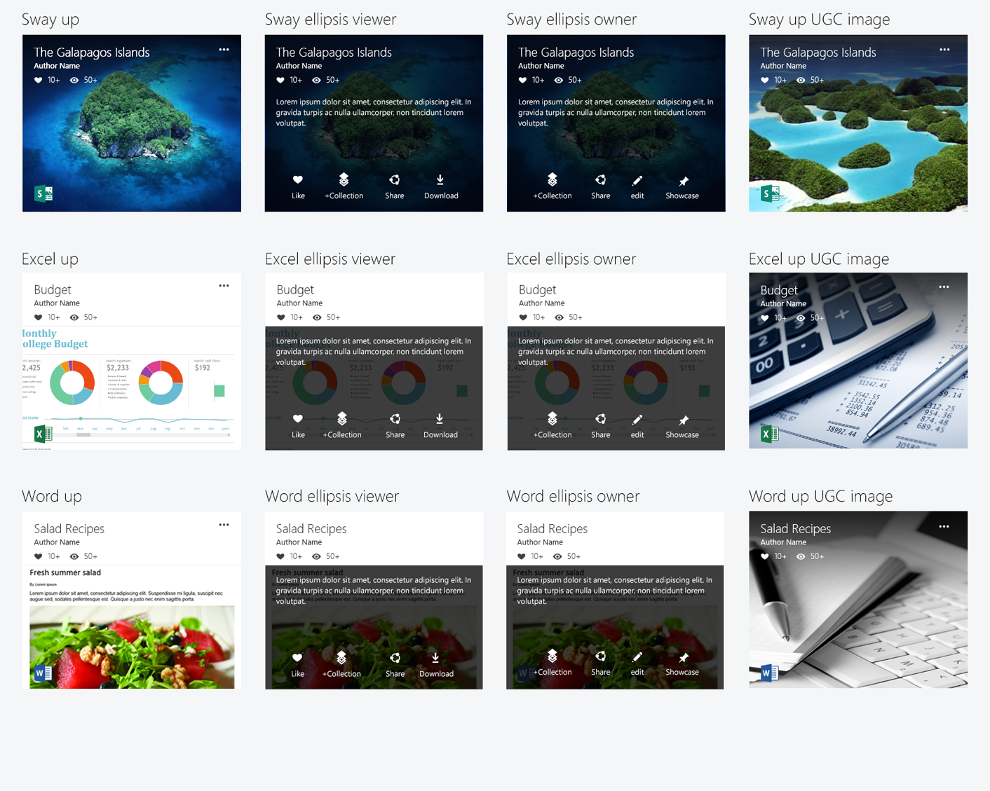
One image, one honest signal
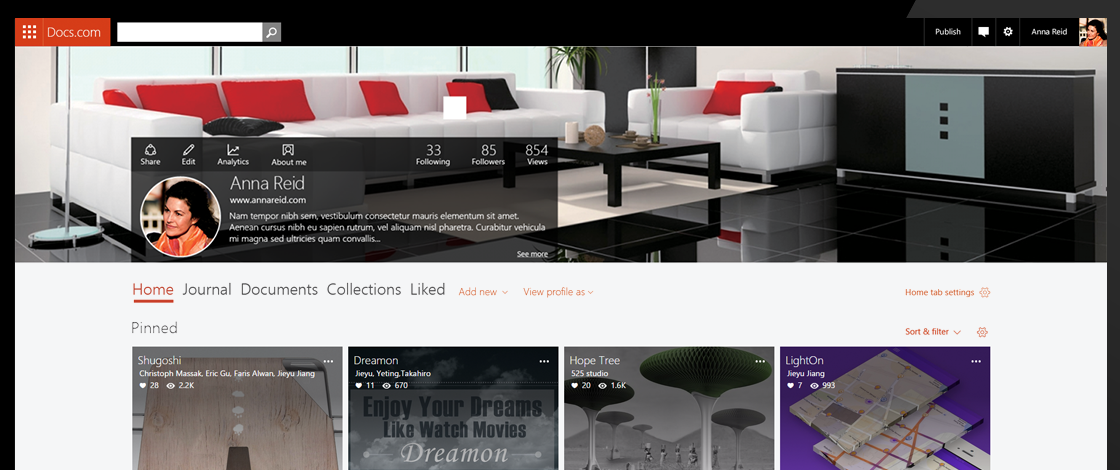
Everything on Docs.com was a tile — a document reduced to one image, a title, and an author. It’s what made a wall of mixed Word docs, decks, notebooks, and PDFs read as one coherent library instead of a junk drawer. I designed the tile to do two jobs at once: give the author a piece of their own brand — a background image they chose — and give the viewer an instant, honest signal about what a document was before they clicked. Microsoft patented the design.
03 — The hub
Turning a visitor into a publisher
The hub was the front door — the page that had to turn someone who’d landed on Docs.com into someone who actually published a document. That first-time author step was the hardest number in the whole product to move, so we didn’t argue about the pitch in a conference room. We tested it.
The hub’s job was to turn a visitor into a publisher. We A/B-tested how it framed that pitch — and the right framing more than doubled author activation, from 1.96% to 4.73%.
Eleven variants over three rounds; first-time author activation as the north-star metric.
One thing the chart doesn’t show: the single highest-converting variant was also the most generic — and shipping it would have meant stripping the character out of the page. So we shipped the one just behind it. A test tells you what converts; it doesn’t tell you what’s worth shipping.
04 — The profile
Where a file became “my place”
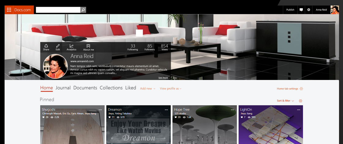
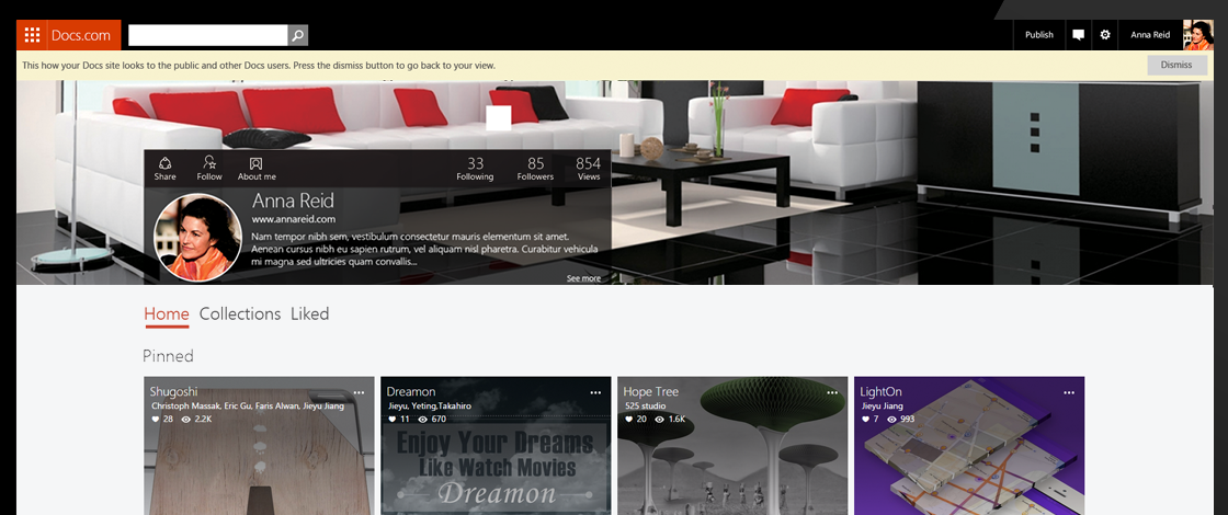
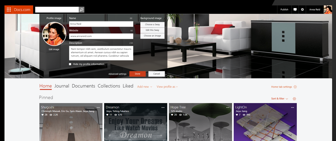
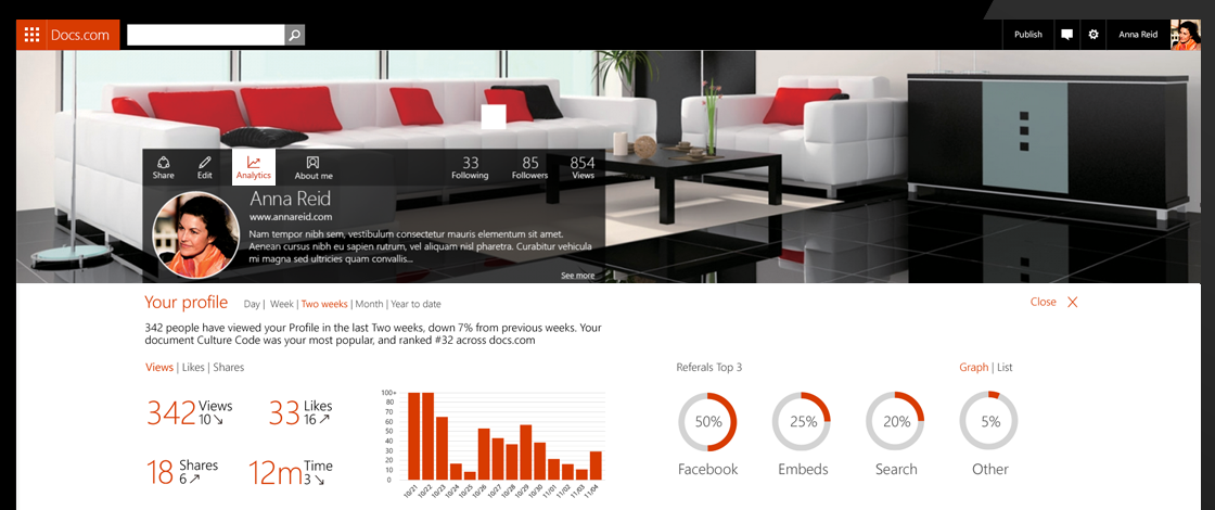
Publish twice and you earned a vanity URL — docs.com/yourname — and the profile behind it became a real home: a journal, your documents, collections you curated, an About page that read like a portfolio. This is where “I posted a file” turned into “this is my place on the web,” so we researched it with real people — lightweight MVPs in front of users, and visits to schools to watch teachers actually publish and share.
The team & the challenge
A real product on a design system in flux
Docs.com was a real Office product, but Office was still inventing its cross-product, web-based design language while I was designing it. The system was in constant flux — page styles and elements kept shifting underneath me — and it is very hard to design a real Office product without a real Office design system to build on. Keeping Docs coherent while the ground moved was the actual job.
The ground moved organizationally too. On Docs.com I moved out of Microsoft’s user-research organization and into the Office design organization in Redmond — the group behind the original Docs framework — under a new design manager. New reporting line, new manager, and a design system being invented in real time.
What kept it honest was evidence over opinion. I built multiple UX and UI flows from the previous team’s research, then A/B flight-tested competing designs and ran user interviews to lift acquisition, engagement, and usability — so what shipped was what the research backed.
Process
Argued out in the open
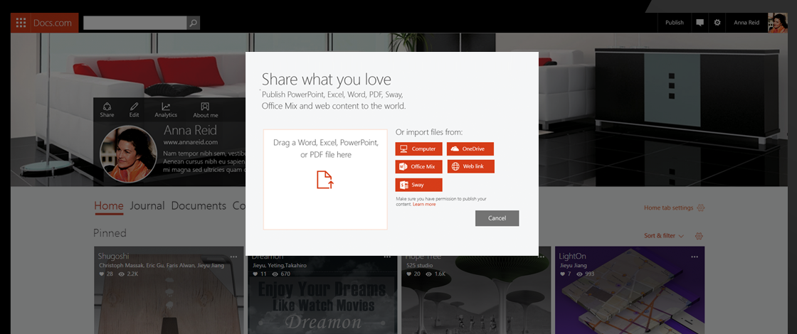
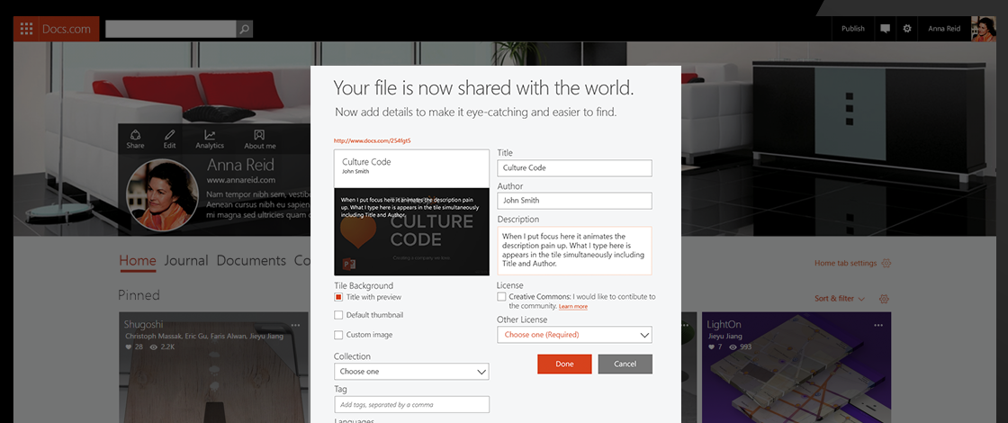
The work wasn’t settled in decks. The publish flow and the hub variants were mocked, put in front of users, and revised on what people actually did — not what we hoped they’d do. The upload flow below is the kind of thing we worked screen by screen, because the moment of publishing is the moment the whole product either earns trust or loses it.
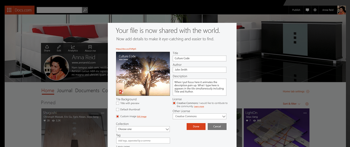
The flow
From a file to a home in six steps
Boil the whole product down and it’s six steps. The fourth one, choosing who sees it, is the one that earns the trust.
- 01Pick a docWord, PPT, PDF, Sway
- 02PublishFrom your PC or OneDrive
- 03Make it yoursTile, title, tags
- 04Choose who sees itPublic, Limited, Org
- 05It’s liveFull fidelity, one link
- 06Found & collectedSearch, profile, collections
That’s the happy path — the six steps that took a file sitting on your laptop and turned it into a home on the web that people could find.
Shipped
A wall of work, coherent
Published documents landed as tiles on your profile and across the site — full Office fidelity, one link, findable by search. A mix of decks, reports, notebooks, and PDFs from thousands of authors read as one coherent library, because the tile did its job.

The loop closes
How people published wrote the next brief
All three journeys end the same way — somebody telling everyone they know. But that’s not the finish line. It’s the feedback that writes the next brief. Watching how people actually used Docs.com — teachers handing out notebooks, consultants building showrooms, graduates turning the profile into a personal home — came right back and shaped what we built next.
- 01People published and sharedLinks on résumés, in classrooms, in proposals
- 02We watched how they really used itNotebooks, portfolios, personal homes
- 03We built the next version on itRicher profiles, collections, analytics
The profile grew because people were using it as a home, not a folder. Collections grew because people were curating. Analytics grew because authors wanted proof they were being seen. Every step answered how the last one actually got used. The product kept writing its own next brief.
A free home on the web for your work — and a link that just opened.No hosting, no webmaster, no mangled formatting. Publish an Office document and it lived on the open web looking exactly as you made it.
Outcome
Microsoft’s real bet on the open web
Docs.com relaunched in 2015 as Microsoft’s real attempt to make the open web a first-class place for an Office document — full fidelity, free, and yours. It grew fast: 12% a month, and 70 million people in its first year. What I designed — the publish flow, the profile, the way people followed and shared, and the patented content tile — proved the idea that your work deserves a home on the web that looks exactly as you made it.
70M+
people reached in the first year
2.4×
first-time author activation, from testing the hub
Patented
content-tile design